RELEASES | 14 September 2026
Nurom Next Arabic: Translating cultural harmony & human connection, through global communication
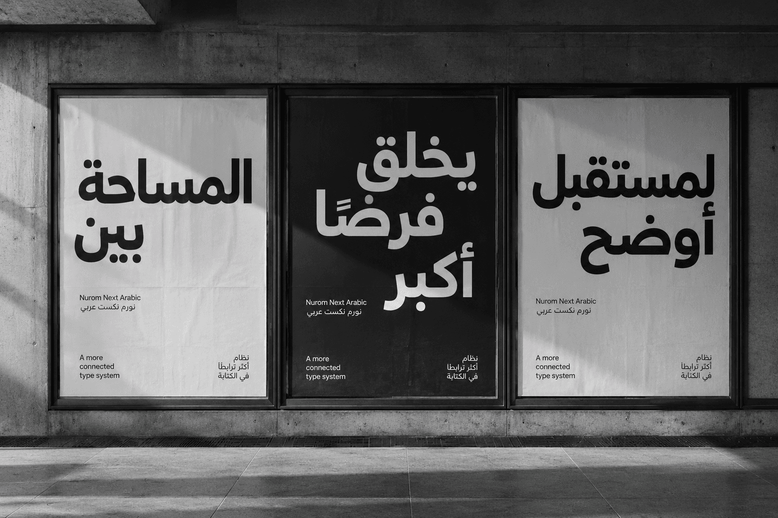
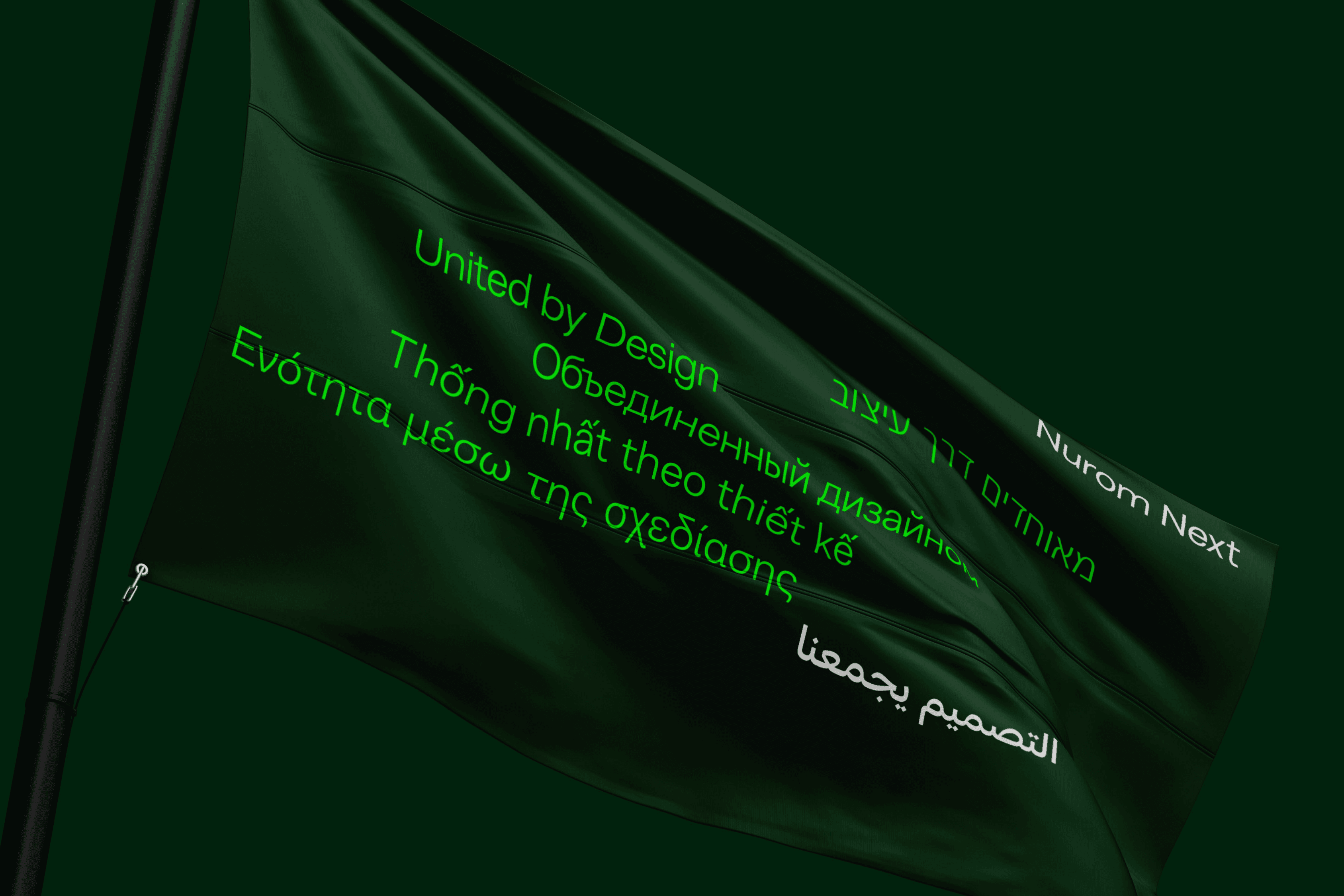
Nurom Next Arabic, is the newest chapter in the story of a foundry that continues to push its own boundaries and grow in capability and class. The Northern Block’s vision to shape a typeface that is as universal as design itself, is growing. Beginning with The Northern Block’s founder, Jonathan Hill, Nurom Next has passed through the hands of designers and consultants from all corners of our planet.
It’s difficult to attribute this contemporary sans serif to one, two or even three people. It’s the invested work of many minds, a project shaped by an international team, and the typographic fruit of the truism that great design doesn’t stand still, it evolves. An ethos that continues to set new standards at the foundry.
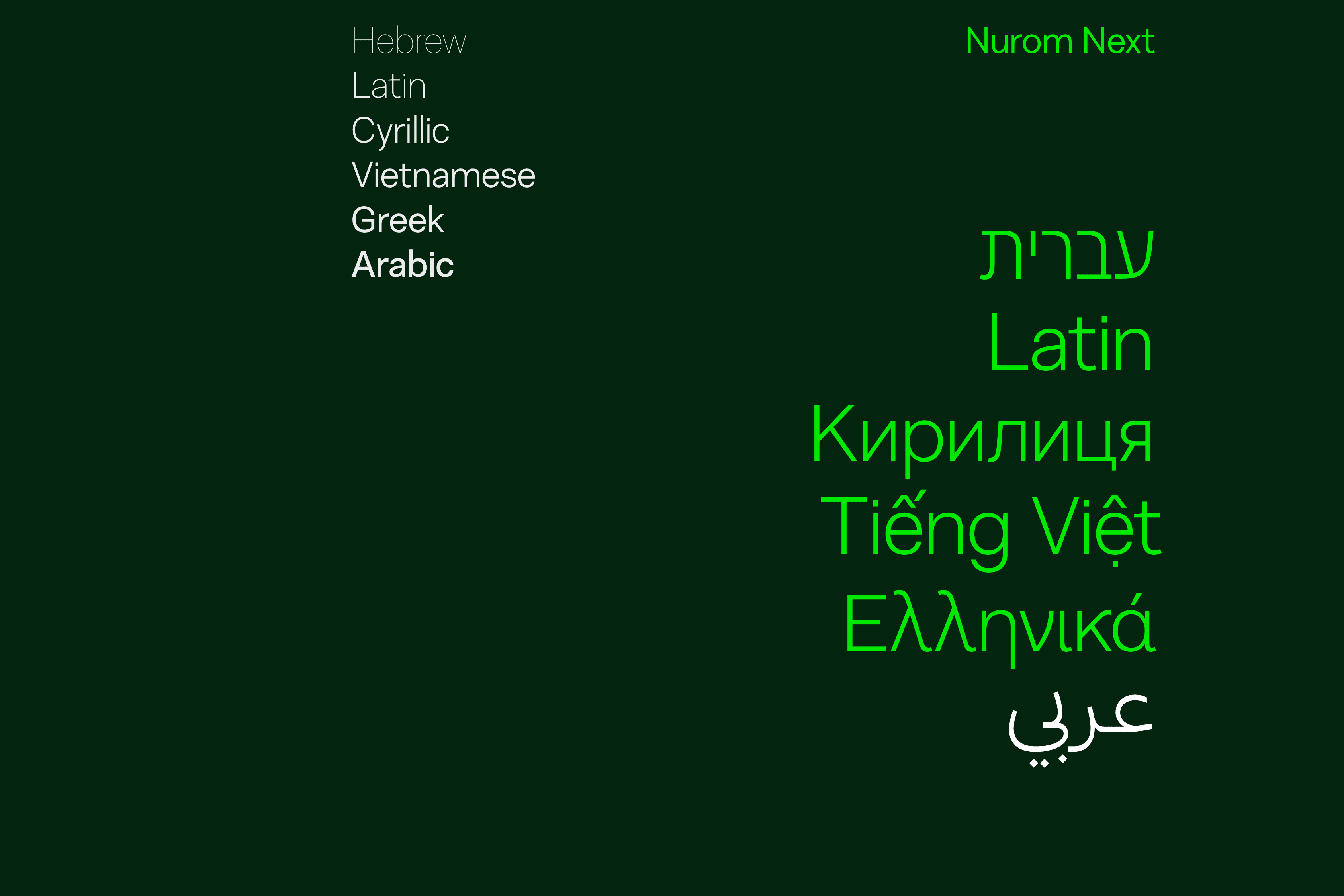
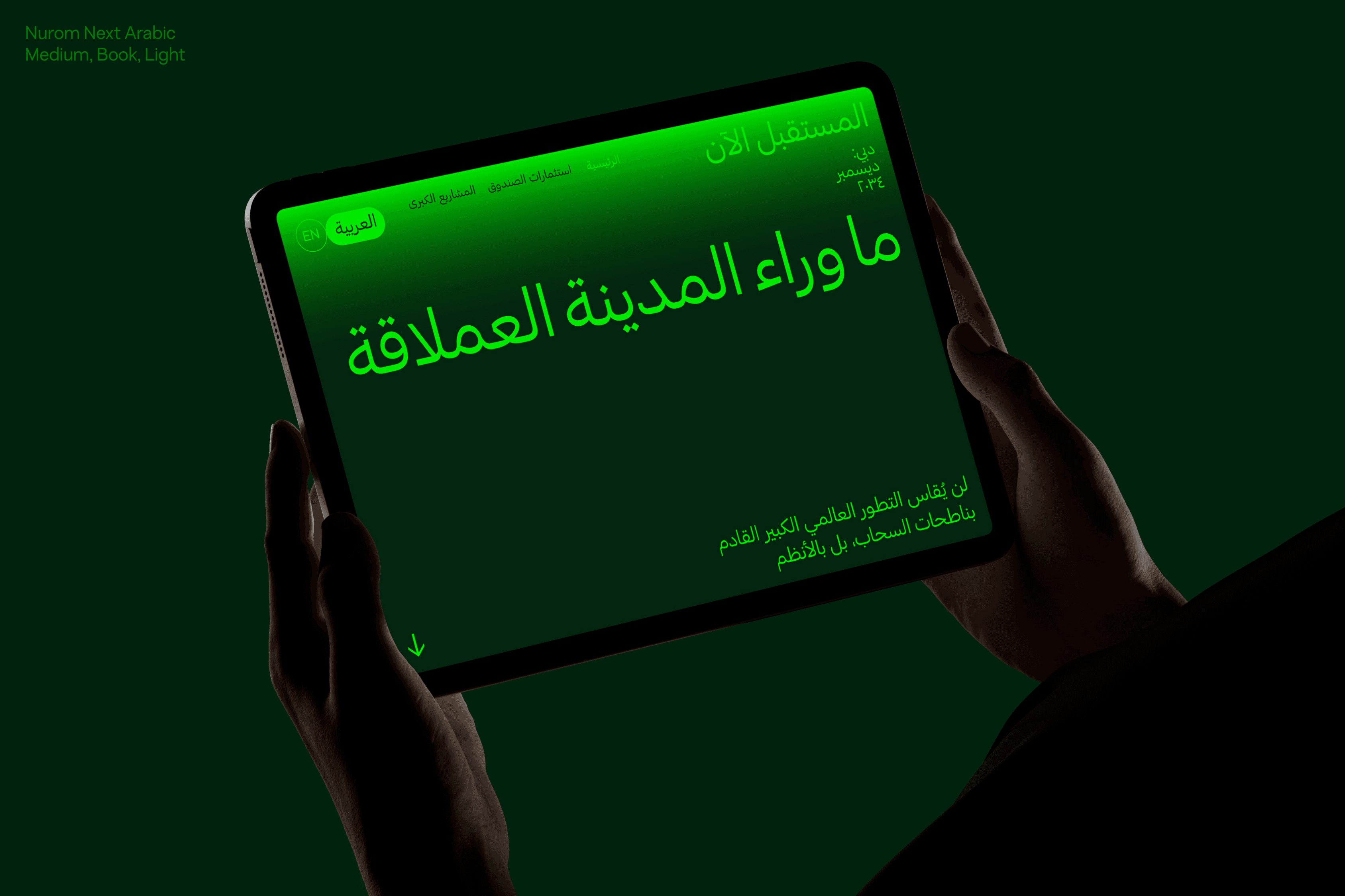
Thanks to the skill and focus of Tasos Varipatis, Type Designer at The Northern Block, and the close consultancy and native experience of Lara Captan, anindependent Arabic type designer and typographer – that global international voice and multi-lateral mind, is now expressing itself through Nurom Next Arabic.
“It’s often difficult to achieve in our industry, where 75% of people work alone, but this is a true collaboration. A team process and a collective vision.” – Jonathan Hill, Founder, The Northern Block
Work by The Northern Block has already caught the attention of high-profile Arabic clients with global brand presence. This fusion of Arabic tastes and the foundry’s own design sensibilities, seems a natural fit, and Nurom Next’s distinctive features have found natural harmony with the beauty of Arabic script.
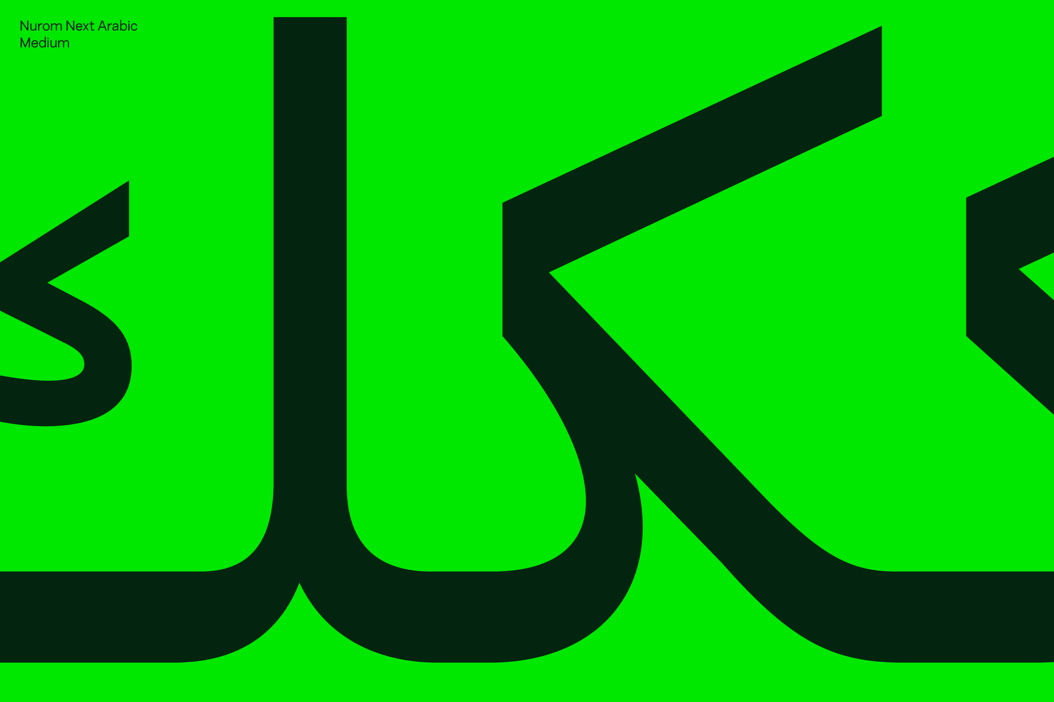
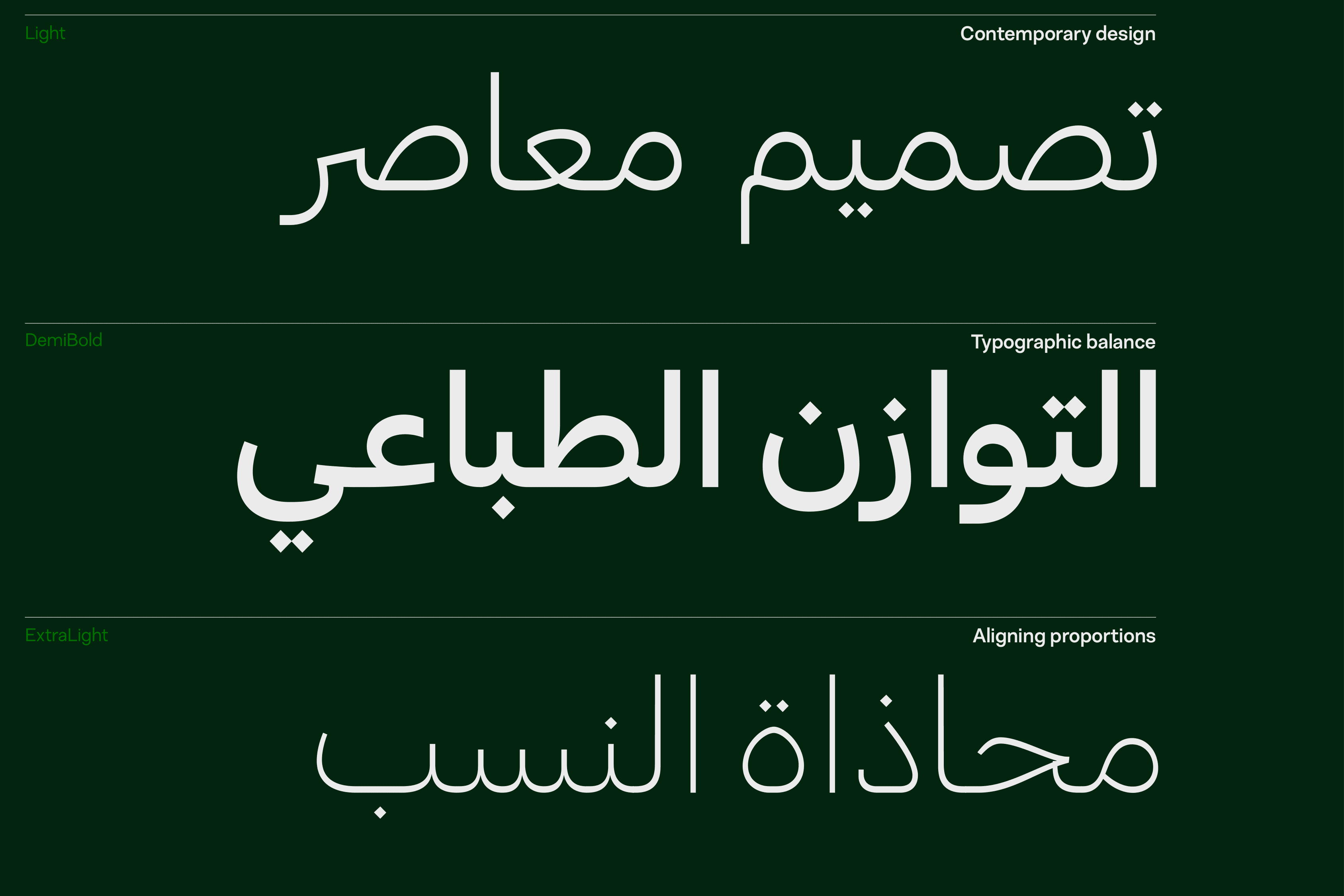
With its fresh blend of historic inspiration and contemporary neo-classic style, Nurom Next retains a human touch that takes us a nuance-width away from the pure maths of classic grotesque typefaces like Helvetica, and into something more personal and relatable. This naturally aligns with the hand-written qualities of modern Arabic. That cursive writing style, that connection, is achieved organically.
The incorporation of warm, irregular elements, and the geometric principles of the neo-grotesque, have translated. It’s all evident in Nurom Next Arabic. Tasos has a flair for Scripts that enables The Northern Block to work with clients in the region and make Nurom Next Arabic work. That calligrapher’s ability to understand the angles of letterforms on paper, is clear in Tasos’ work. It’s an instinct honed in the experience of working with reverse contrast – a characteristic shared by Greek, Hebrew, and Arabic scripts – where horizontal strokes are often heavier than verticals.
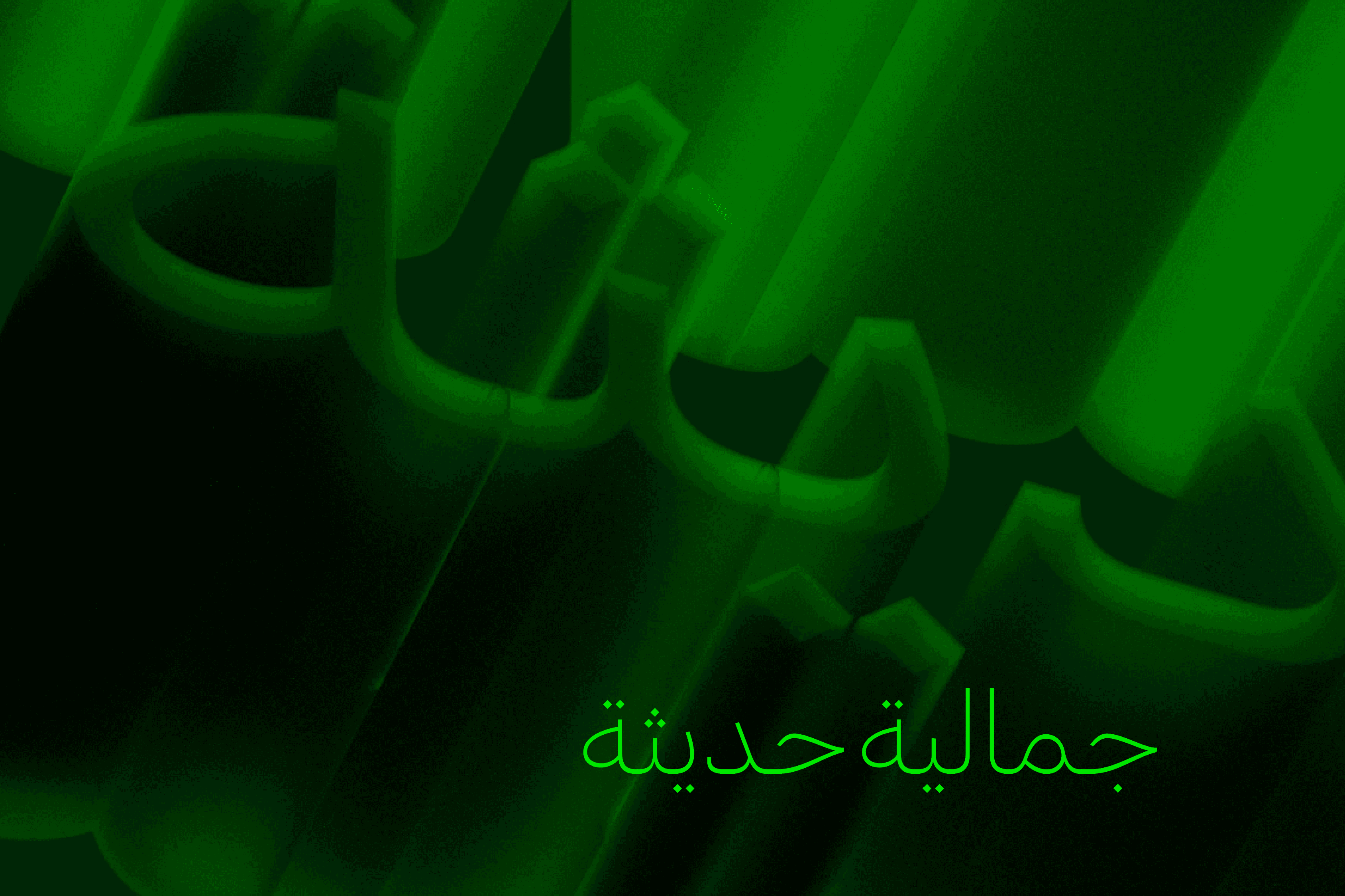
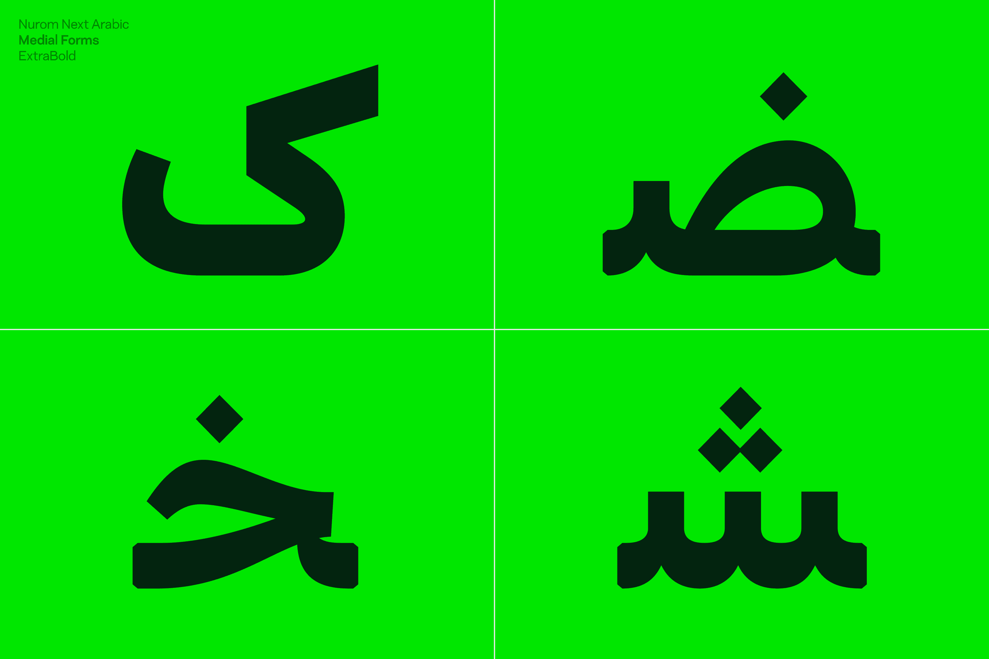
The involvement of native expert Lara Capstan was also essential. Close collaboration between the two has shaped Nurom Next Arabic to be technically, culturally and linguistically sound when communicating in Arabic, Persian(Farsi), Kurdish and Urdu. Lara’s input has given the typeface authenticity, and the right level of sophistication. Her support has ensured that the heritage, culture and conventions of Arabic script have been respected and incorporated when bringing this modern typeface to life. Her impact is there in the shape of specific letterforms that show a deep understanding of how Arabic letters are actually written, and how an Arabic hand flows.
Special joining forms are included in Nurom Next Arabic which enhance the script and improve readability. When two letters are joined, there are functional changes to both letters that aid usability, and take on a form of shorthand rooted in the way Arabic script was developed and written, with characteristics that deliver words expressively and succinctly. Accents, or ṭashkīl, are also incorporated, and are specifically used when typesetting texts like the Quran, Psalms, or children’s books to help with correct pronunciation. Some exist to help readers to know whether something should be spoken, sung or pronounced, enabling communications to be written and read with clarity in any context.
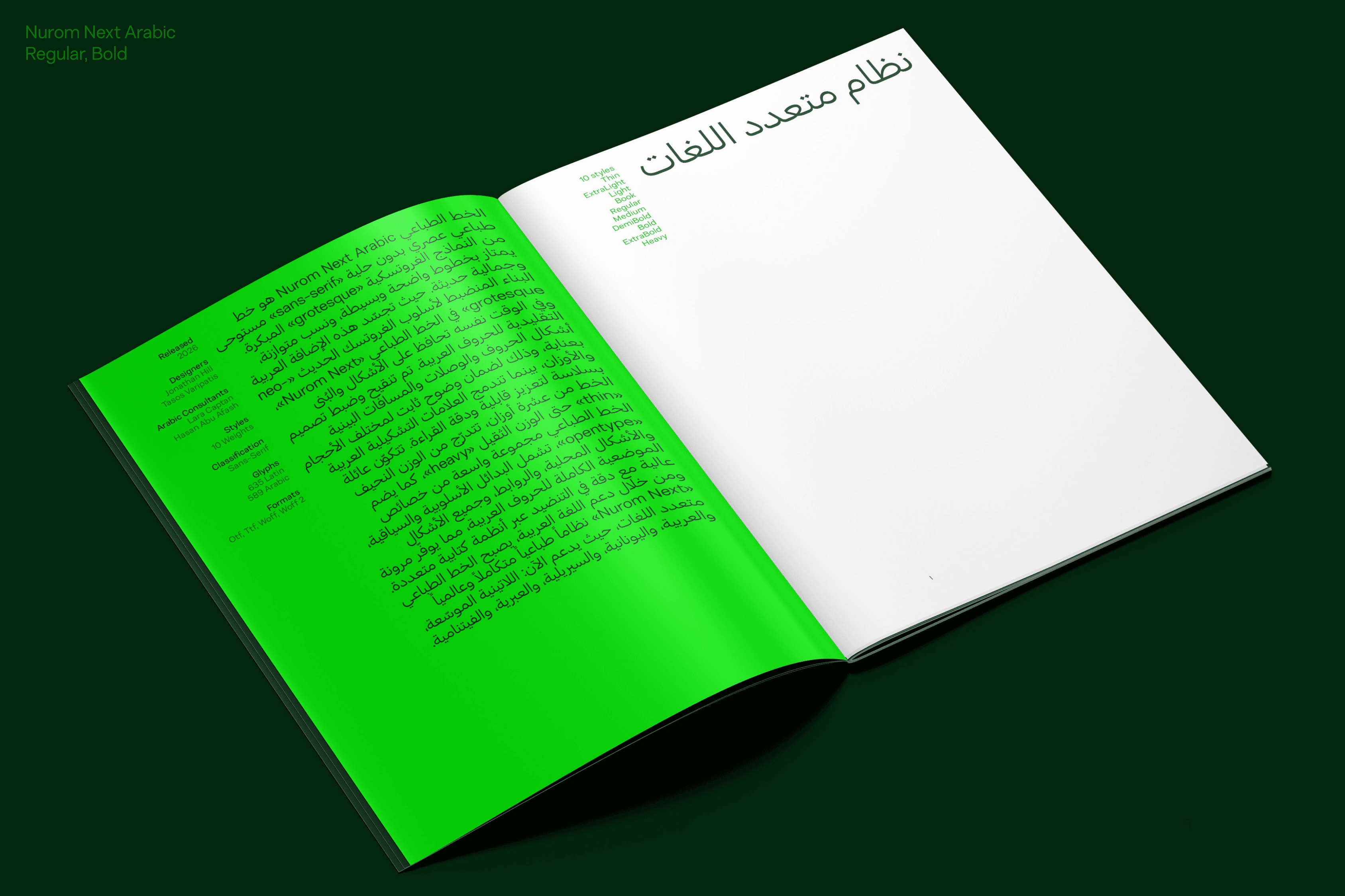
“Arabic script is an amazing system of letterforms, and its history is incredible. It makes for an inspiring subject in type design. Staying true to the forms and proportions of the script rather than it being imposed on a Latin framework, was one of the biggest challenges.” - TV
Nurom Next Arabic is an act of studying and making careful iterations to create coherence and refinement, when balancing heritage and contemporary design. It aligns the script, the system, the language forms, letters and proportions. Careful attention to spacing and weight distribution has ensured stable text colour, consistent performance across paragraphs and sizes, and precision across weights.
Clarity, structure, and coherence are preserved from Thin to Heavy. The result is a typeface that performs reliably while maintaining authenticity, legibility, and typographic balance across languages. The richness and heritage of the Arabic script has been captured and translated into modern, usable type design. History has been honoured. Its traditional beauty is preserved, and translated with fresh personality and distinct character. That contemporary aesthetic, those clean lines and balanced proportions have been blended with the calligraphic character of the Arabic script.
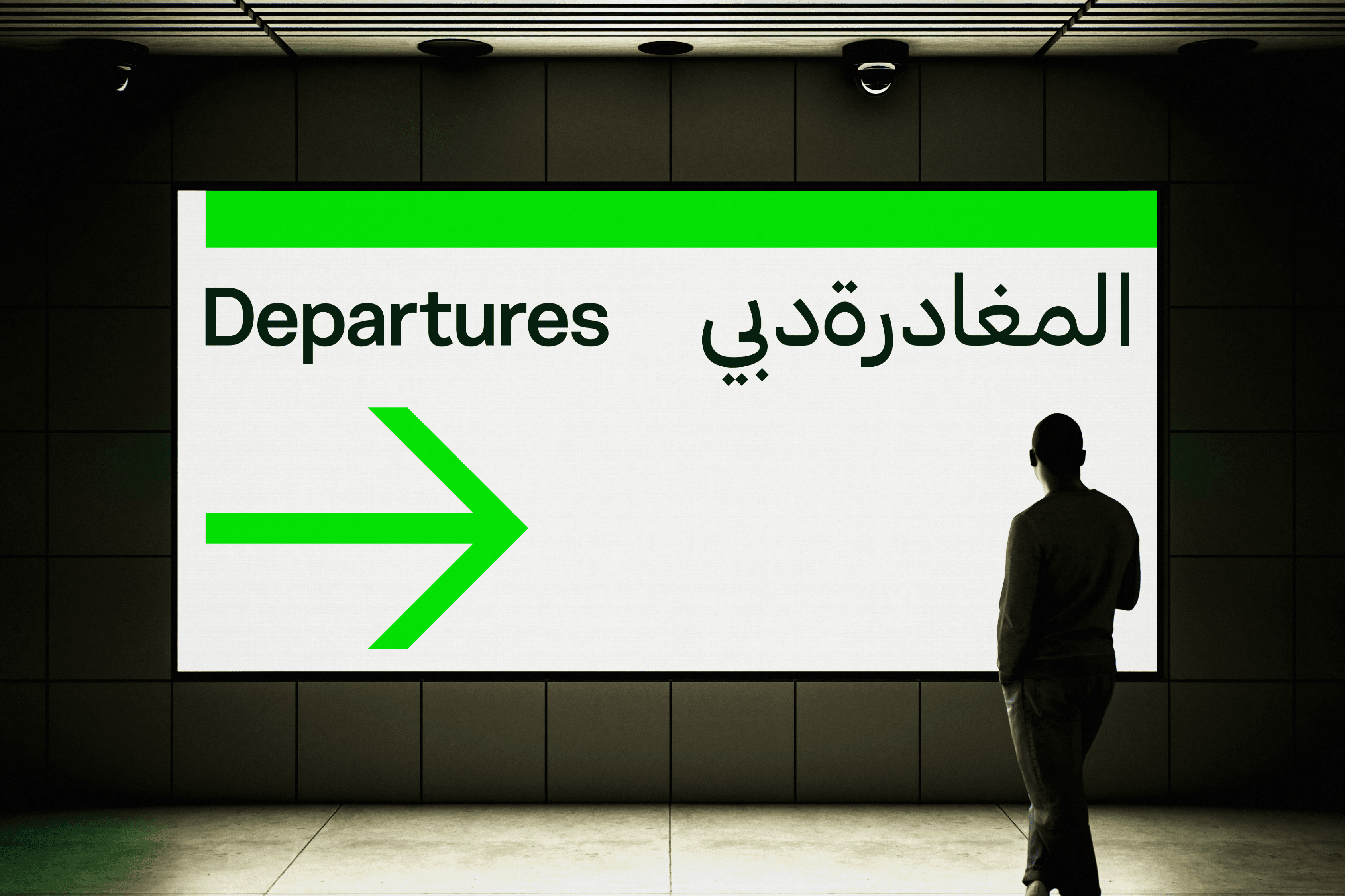
Arabic organisations can rest assured that the same level of care has been applied in all of the Latin-Based languages that Nurom Next Arabic supports. It will deliver multi-script harmony, allowing brands to integrate seamlessly across cultures. To make for coherent and respectful translation of culture, form and tradition, into modern demands and experiences.
‘It makes me really proud, seeing the Nurom Next system evolve into something truly global. Extending into Arabic isn’t about adding another script. It shifts the fundamentals of how and where the typeface can be applied, and come to life. It’s a global asset.’-TV
The Northern Block is clearly a place where designers have the freedom and fluency to make remarkable things happen. This is a type foundry determined to grow, evolve and deliver high-performance typographic beauty. They are broadening their reach. They think and design globally, universally and progressively. Building typeface systems that synergise the vision, talent and efforts of people from Europe, India, The Middle East, and South East Asia. Nurom Next Arabic is clear evidence of The Northern Block’s competency in a multi-skilled global environment. It has involved the crossing of challenging thresholds in the design. This typeface is the latest statement that they are continuing to elevate what they do. It levels up the foundry’s ability to service the world, and speak across it.
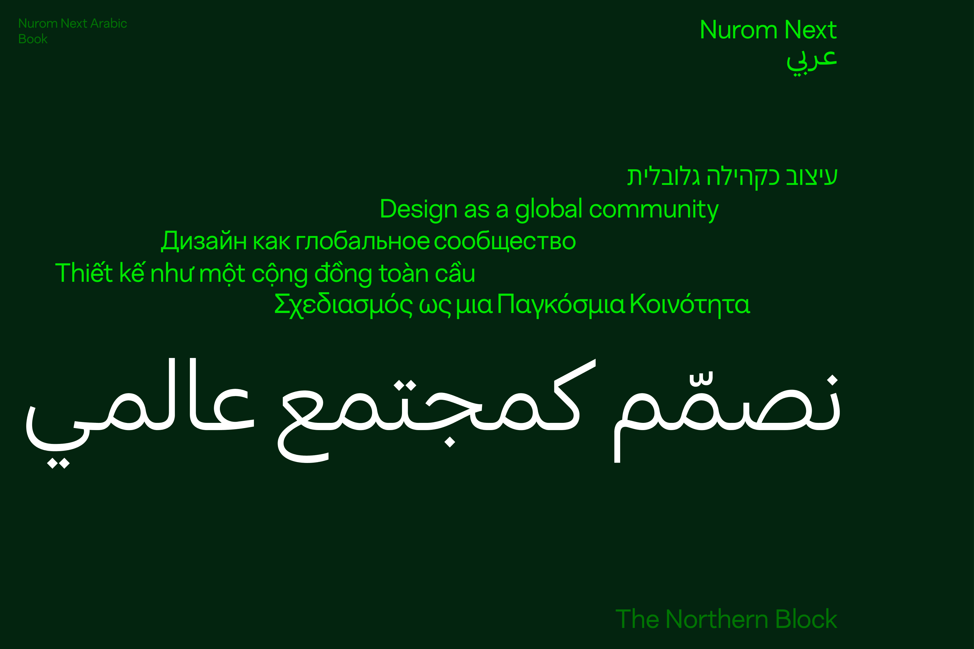
‘Nurom Next has been on a journey from Latin into Hebrew, so we’ve become experienced how to adapt everything that is strong about Nurom Next, to make a powerful partner in Nurom Next Arabic.’ – JH
A typeface with a development legacy like Nurom Next Arabic, can build a legacy for high calibre brands, and deserves to. The typeface has the pedigree, performance and presence to help bring global events and brand experiences to life. It’s so fluently multi-lingual that audiences can share a unified experience across Arabic, Cyrillic, Greek, Hebrew, Indian, Latin-based languages, and Vietnamese.
Any design system that can allow a person, brand or organisation to communicate their personality globally, and be understood, merits respect. Notions like Peace, Co-operation and Harmony, are universal. It feels like an important time to be finding new ways to communicate them across cultures. It’s moving to consider that designers and consultants from the UK, to Greece, Israel and Lebanon, are part of the story of making Nurom Next Arabic speak those notions, emotions and feelings in unity.
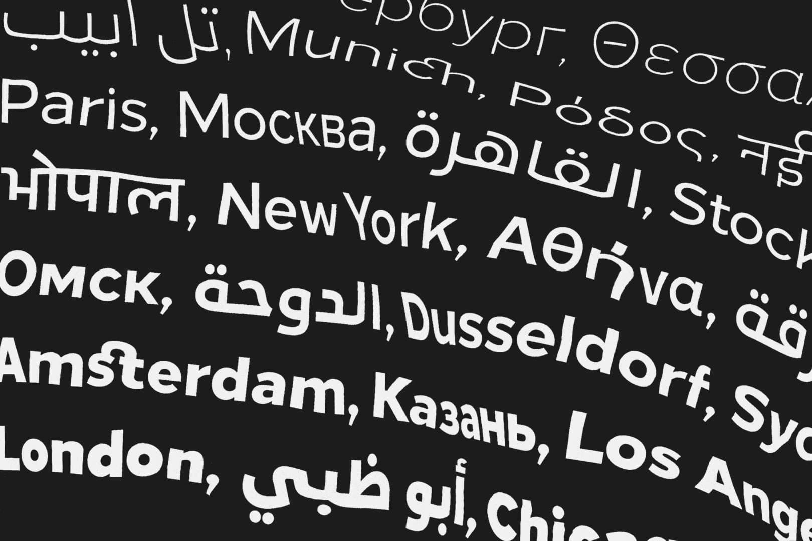
Diversifying design, enabling evolution and mastering universal communication. — The story of The Northern Block’s ‘Next Series’.
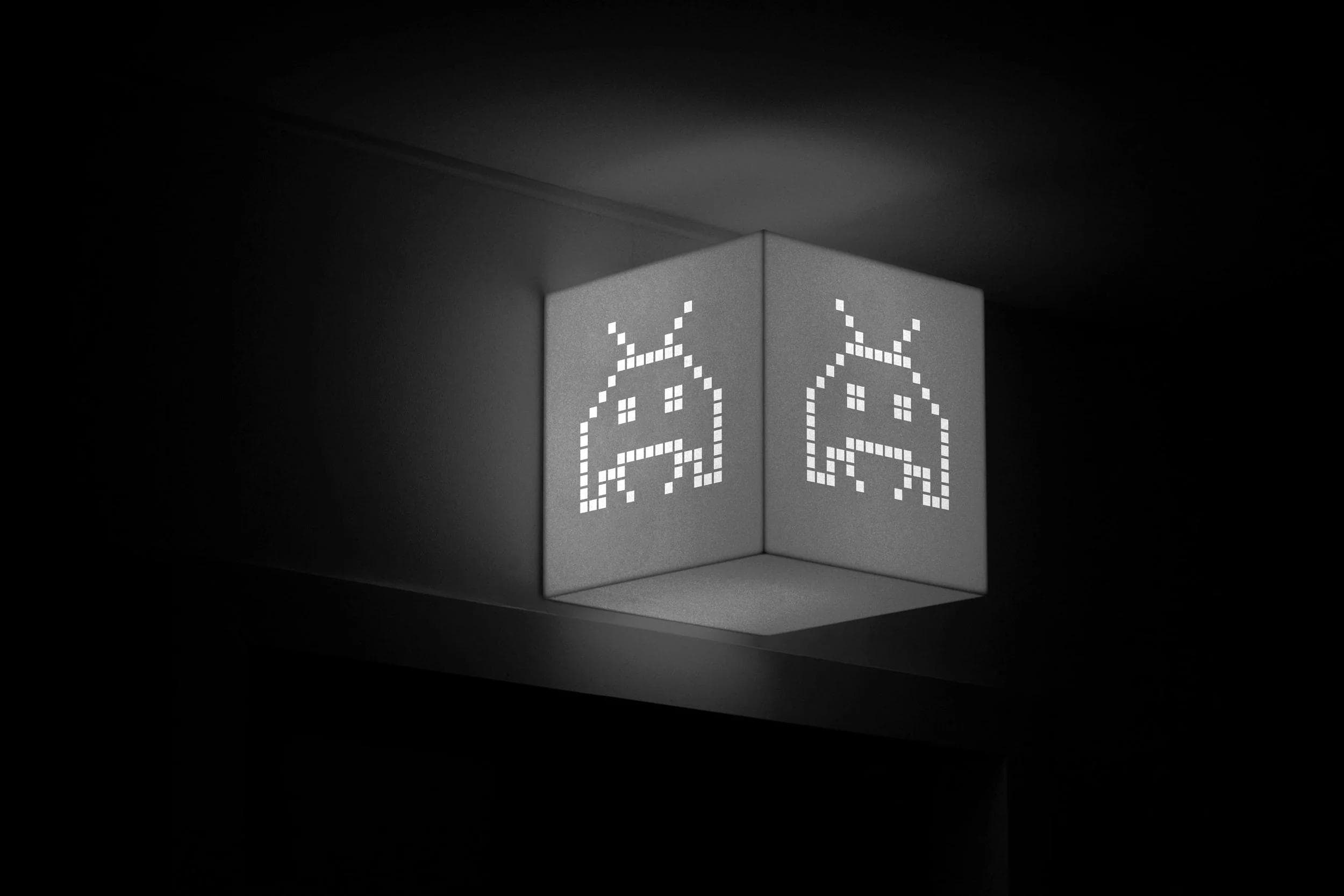
Boxal—The retro typeface with an arcade in its veins. Drop your day job, and come play in a pixelated multiverse.
The Northern Block’s 2025 in Review: New Scripts, Historic Revivals, and a Year of Creative Collaboration.