RELEASES | 7 October 2026
Neogram Text: Refining Neogram for Reading
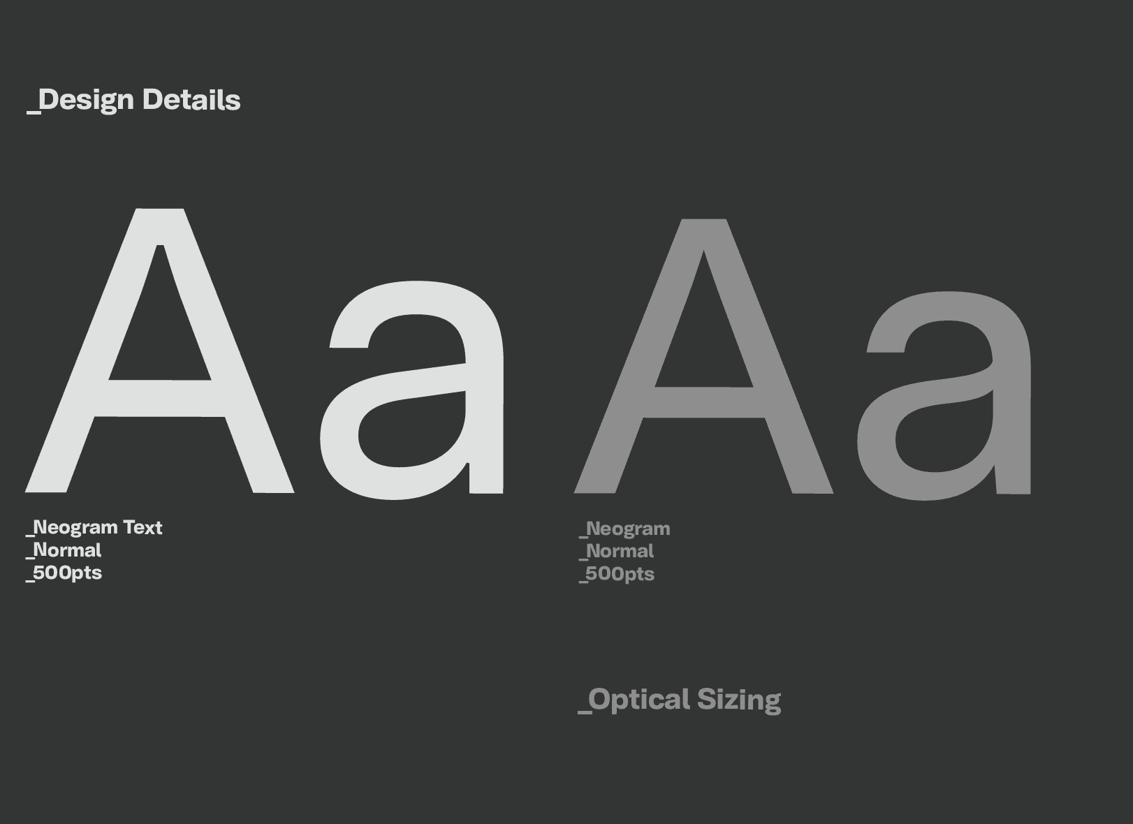
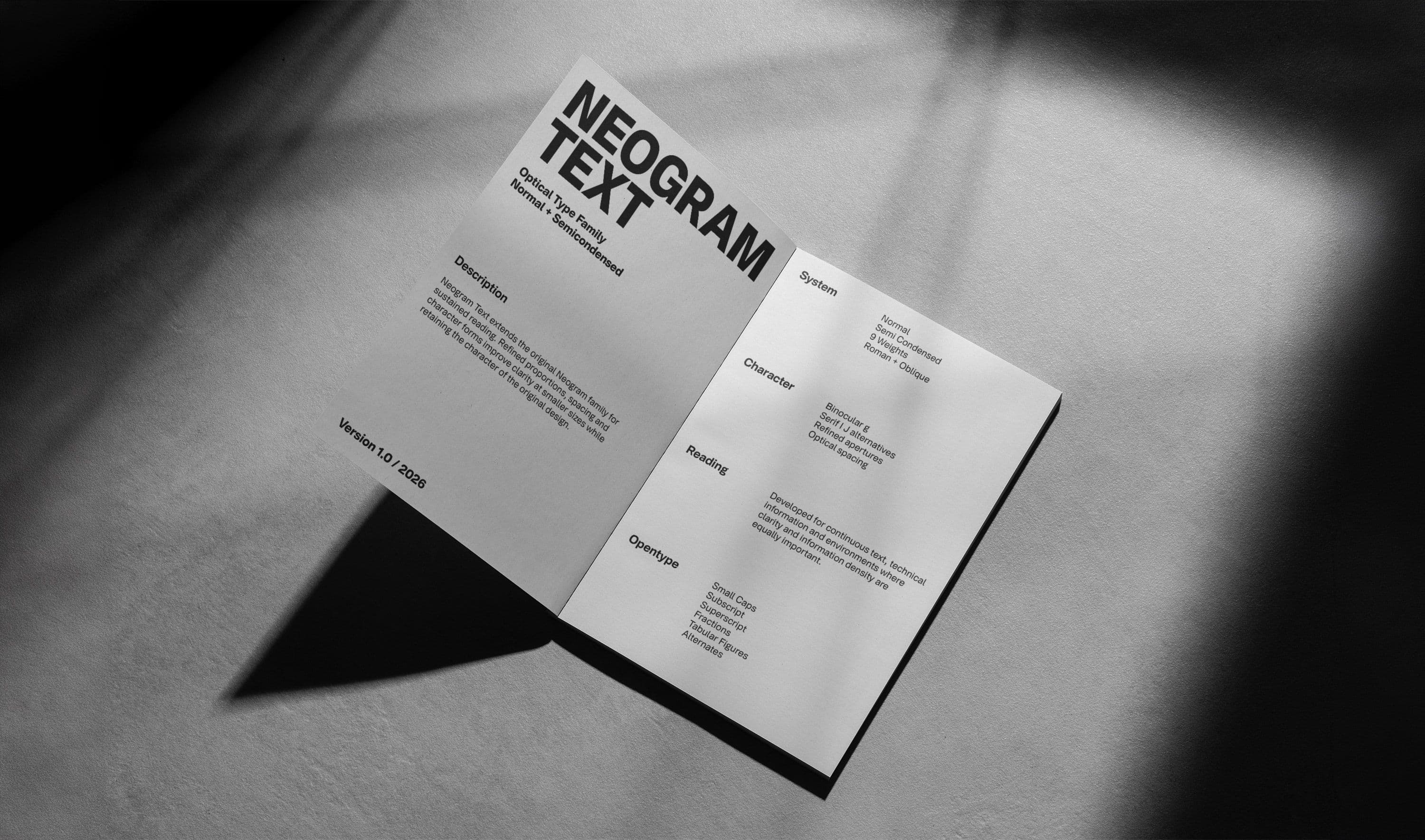
Neogram Text refines the character of the original Neogram for sustained reading, with carefully considered proportions, spacing and details focused on clarity and information.
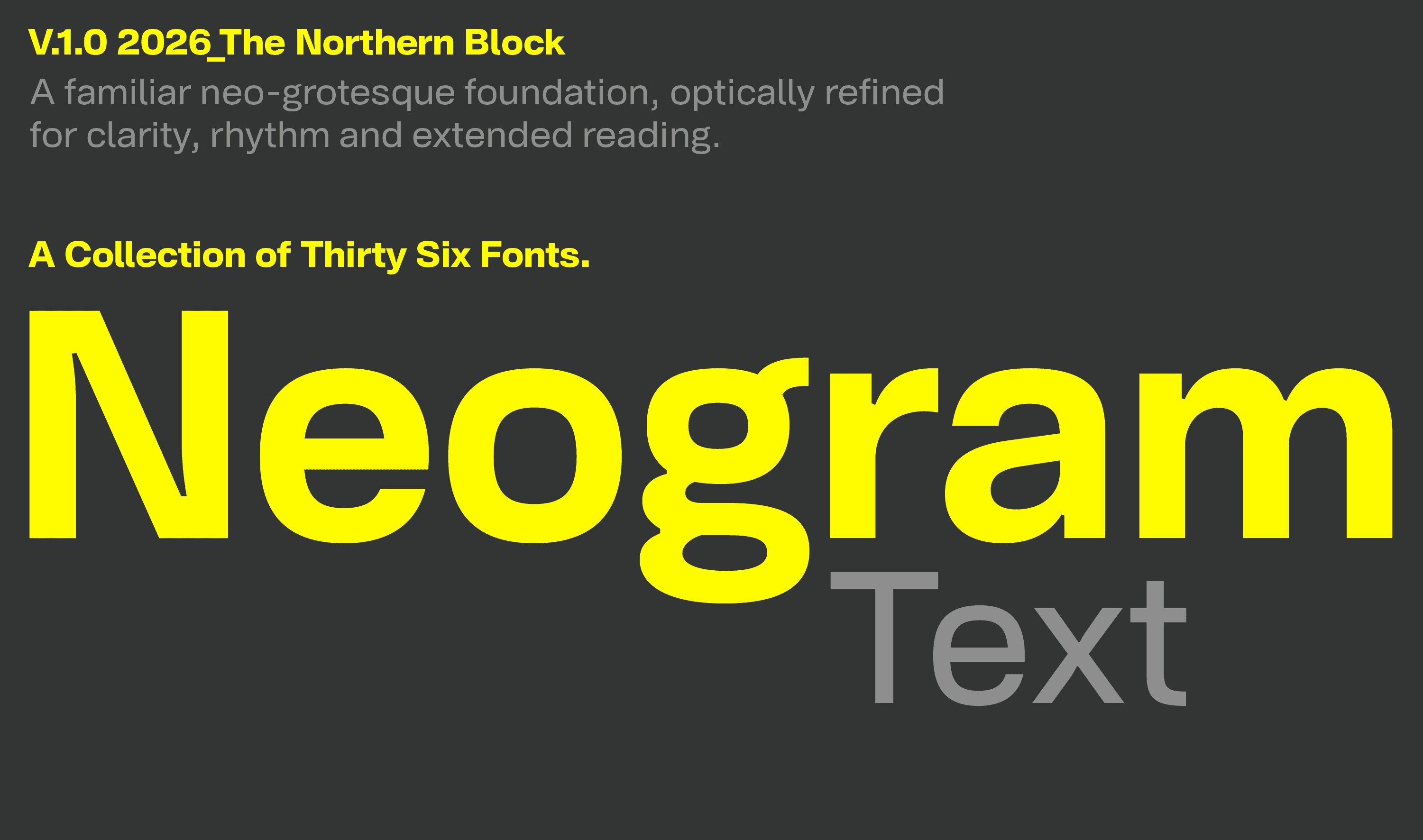
Neogram has continued to evolve since its original release, but not every development needs to make the family bigger.
Neogram Text began with a different question: what happens when Neogram is designed specifically for reading?
Rather than reproducing the full range of widths, the project focuses on Normal and SemiCondensed. Proportions, spacing and individual character forms have been reconsidered for smaller sizes and sustained reading, while retaining the underlying character of Neogram.
It is less an expansion of the family than a refinement of its purpose.
A Different Direction
The original Neogram was developed as a broad typographic system, moving between display, branding and editorial applications.
Neogram Text is deliberately more focused.
The family concentrates on just Normal and SemiCondensed. Normal provides the foundation for continuous text, while SemiCondensed allows more information to occupy the same space without becoming overtly compressed.
The aim wasn't to create another large family, but to identify what was necessary for reading and develop those elements properly.
Refining the Details
At smaller sizes, the relationships between characters become increasingly important.
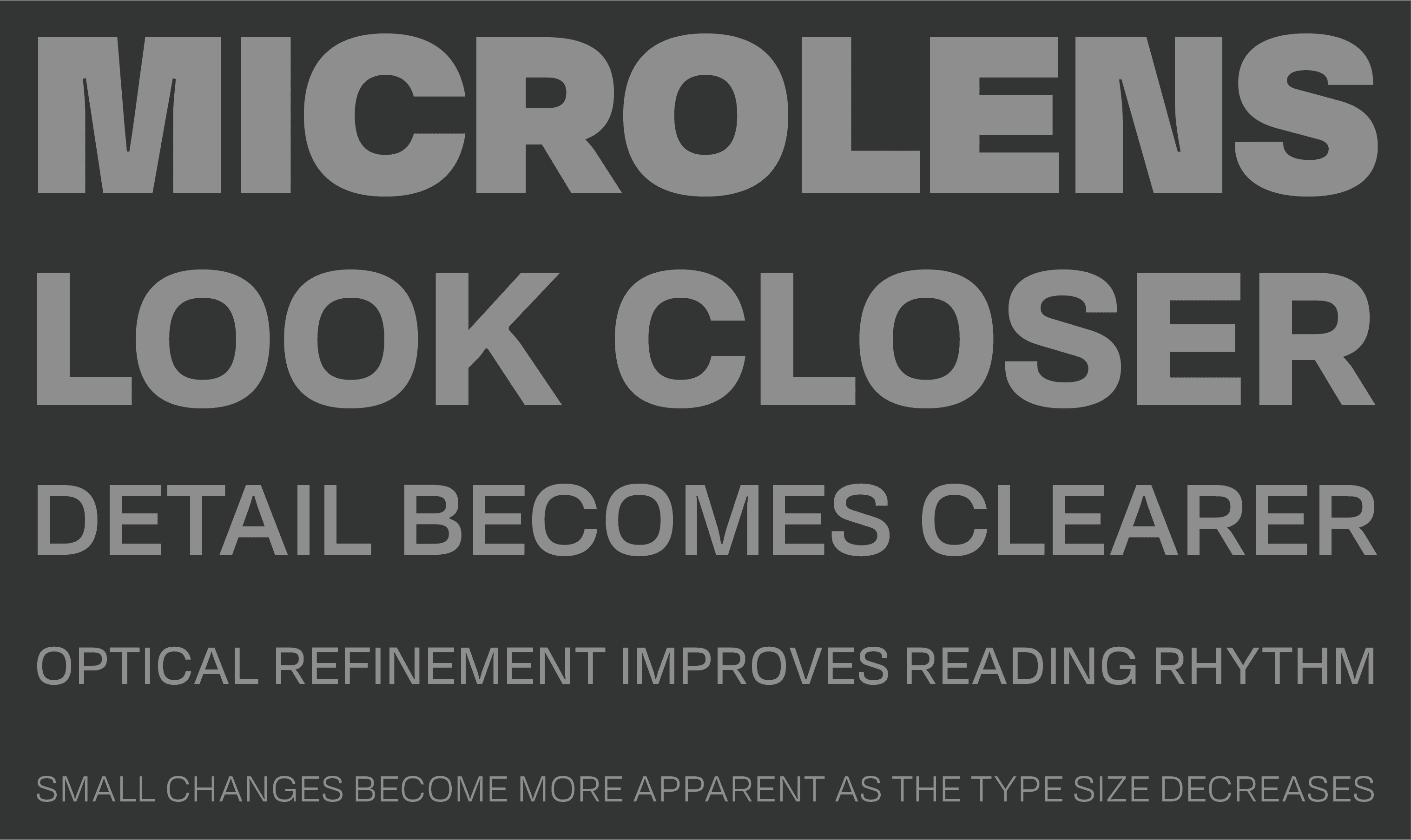
Counters, apertures, proportions and spacing all contribute to the rhythm of a line. Changes that appear insignificant in an individual glyph become much more noticeable across a paragraph or page.
Neogram Text therefore wasn't created by simply reducing the original design. Characters and spacing were reconsidered optically, with greater emphasis on how they perform together.
Character Recognition
Some changes are more visible.
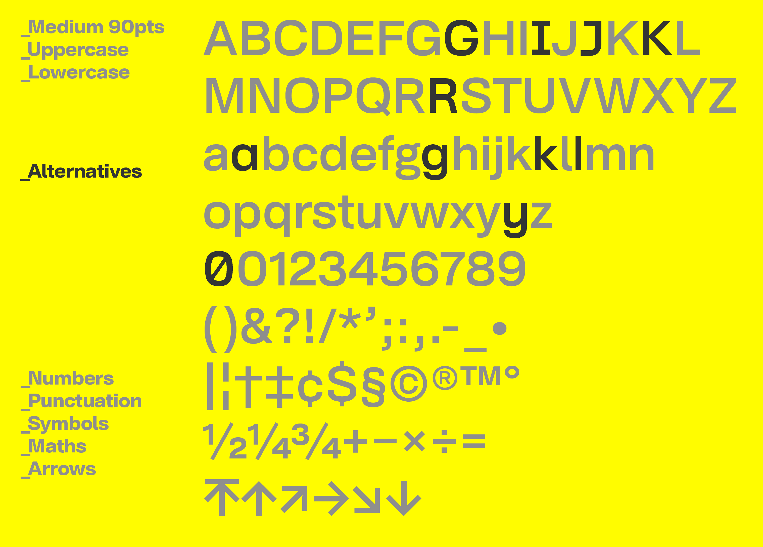
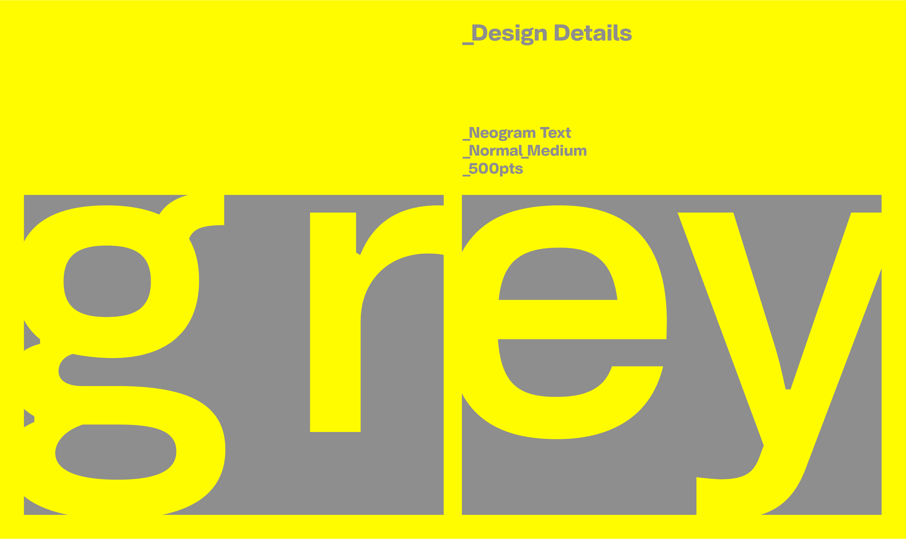
The lowercase g now uses a binocular construction as its default form, while serif alternatives for the uppercase I and J provide greater differentiation between similar characters.
These aren't intended as stylistic gestures. They are practical changes designed to improve recognition within continuous text.
The intention is to make the characters work harder without making them more conspicuous.
Normal + SemiCondensed
Reducing the family to two widths was an important part of the project.
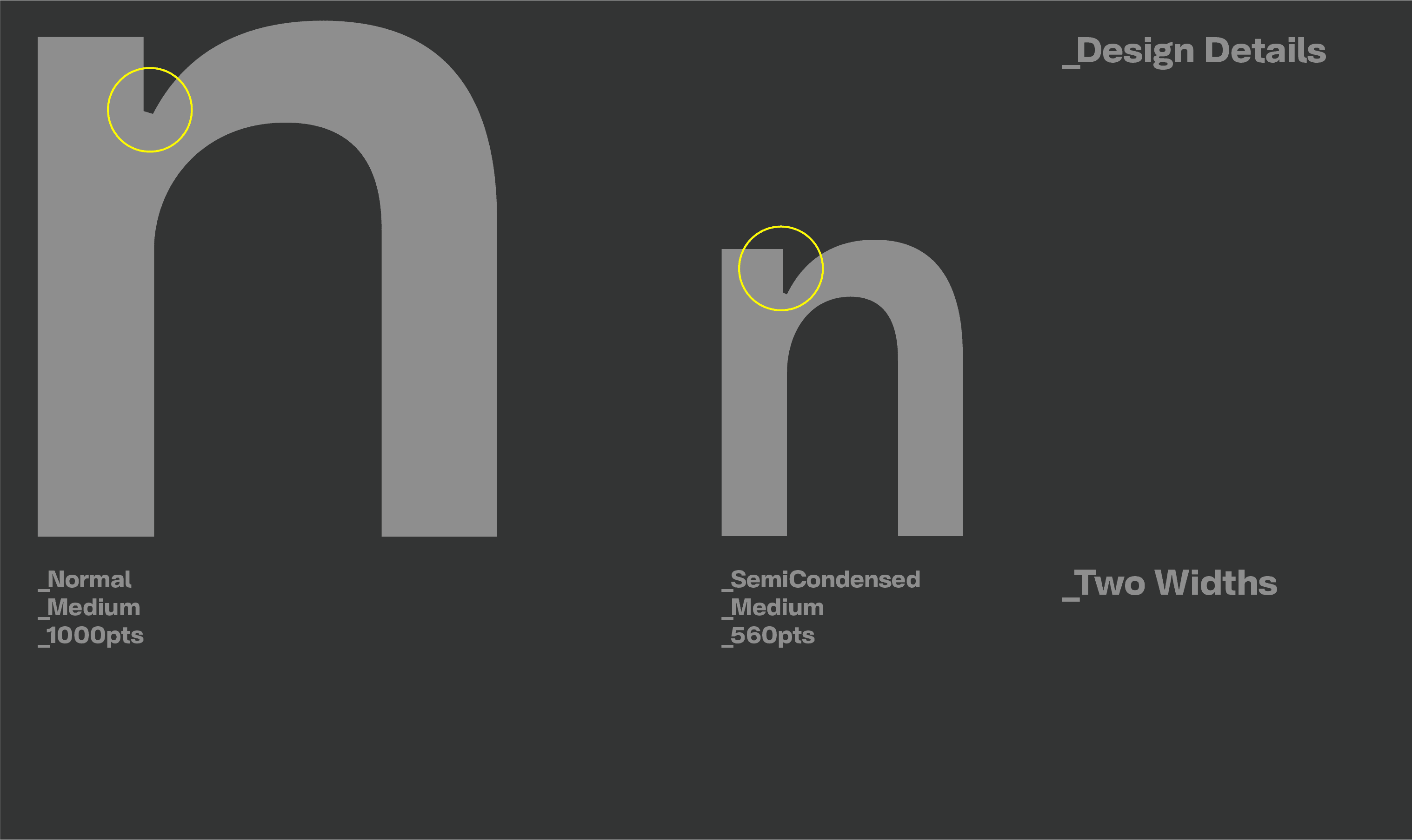
Normal provides comfortable proportions for general reading. SemiCondensed, approximately 15% narrower, increases information density without moving into the compressed appearance of a conventional condensed face.
The narrower width has been optically redrawn rather than mechanically compressed, with adjustments to counters, apertures, strokes and spacing.
Together, the two widths form a simple and purposeful system.
Information as a Theme
The presentation developed alongside the typeface.
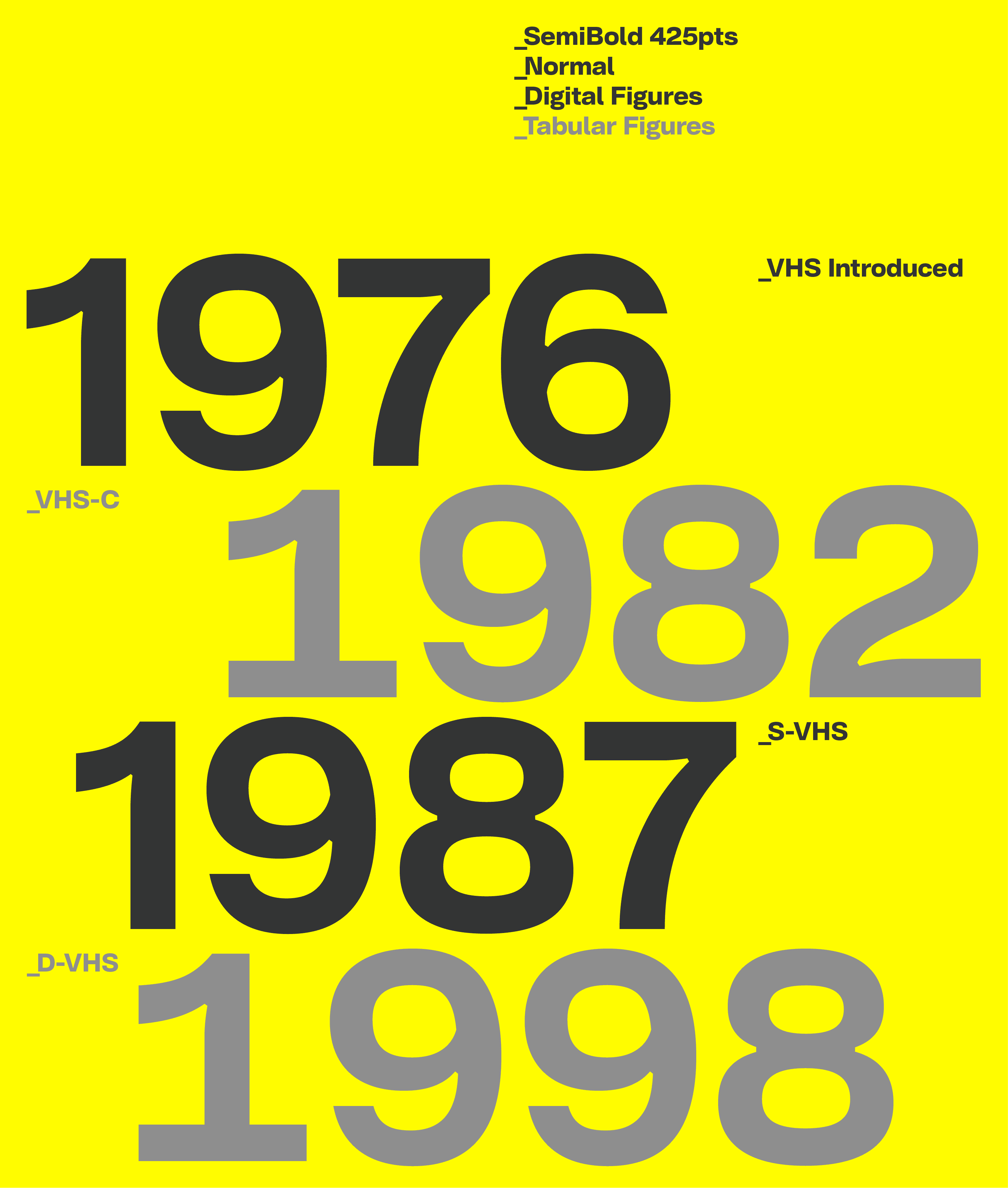
Analogue recording technology, technical manuals and archive systems provided a visual language built around information rather than decoration.
There is a useful parallel. Recording technology captures, preserves and reproduces information. Text typography has a similar responsibility.
Recorded. Copied. Archived. Restored.
Each stage preserves what came before while adapting it for another purpose. Neogram Text follows much the same principle.
Designed for Reading
Neogram Text isn't simply Neogram at a smaller size.
The two families share the same underlying identity but have different priorities. Neogram remains the broader typographic system; Neogram Text concentrates on environments where reading, hierarchy and information take precedence.
The aim was never to replace the original, but to apply what has been learned through its development to a more specific problem.
It continues the same principle that has guided Neogram from the beginning: evolution rather than reinvention.
Neogram Text — the character of Neogram, refined for reading.
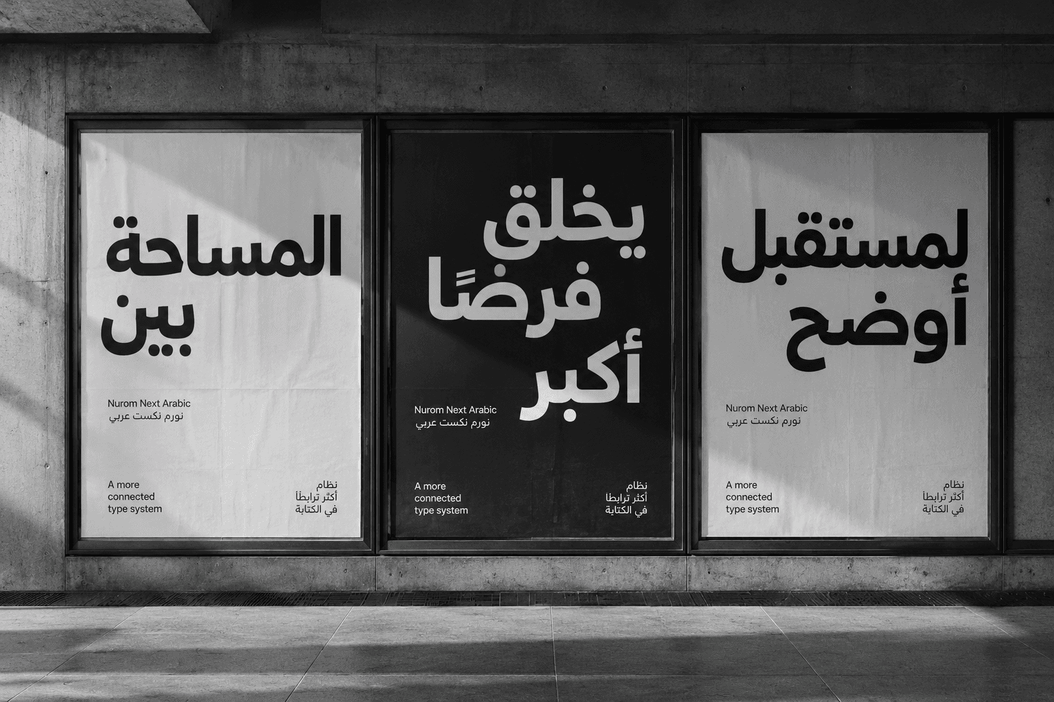
Nurom Next Arabic: Translating cultural harmony & human connection, through global communication
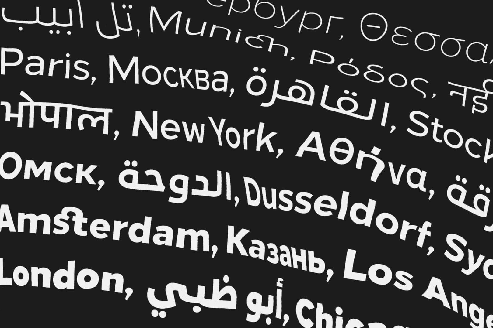
Diversifying design, enabling evolution and mastering universal communication. — The story of The Northern Block’s ‘Next Series’.
Boxal—The retro typeface with an arcade in its veins. Drop your day job, and come play in a pixelated multiverse.