Mekon — Ready Player One and Ready Player Two
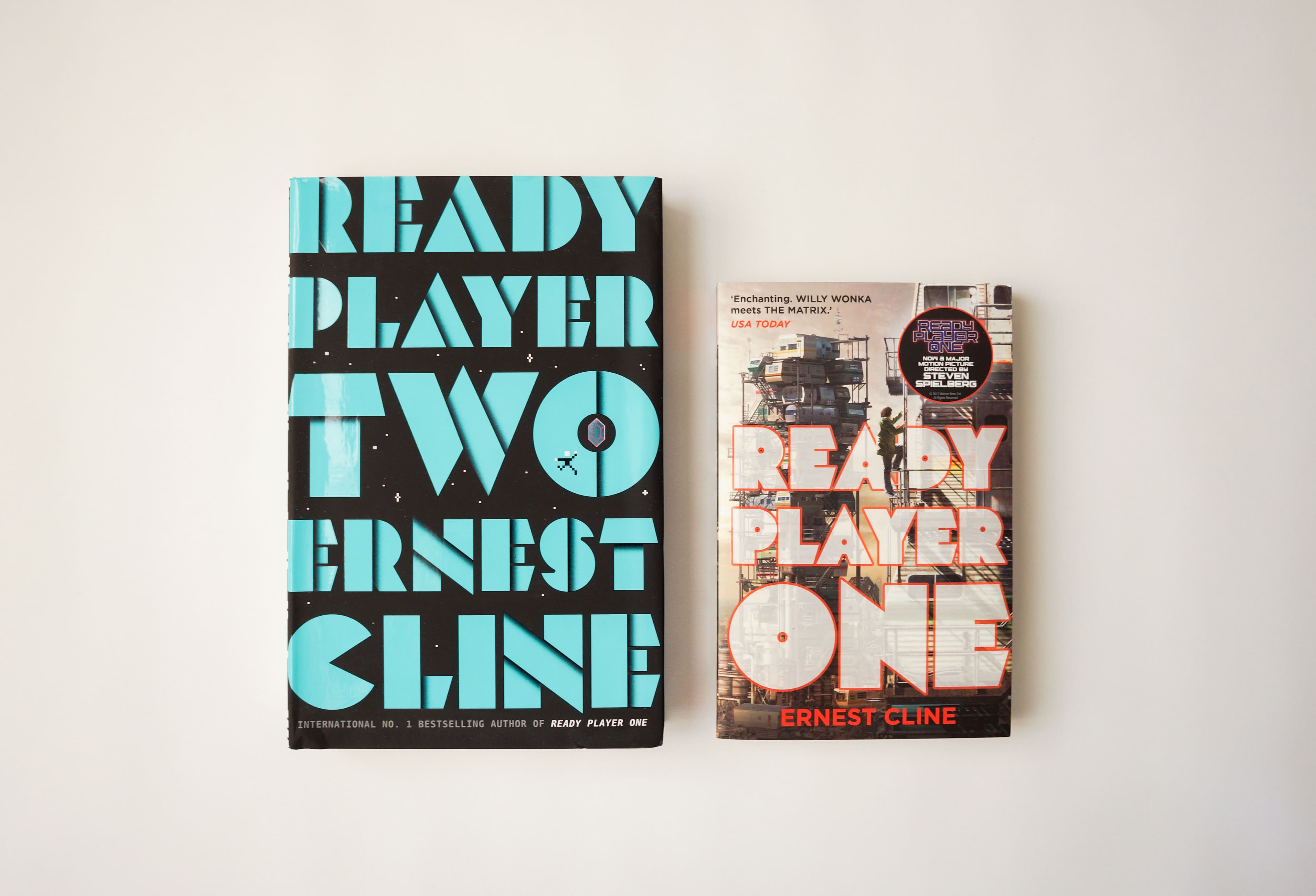
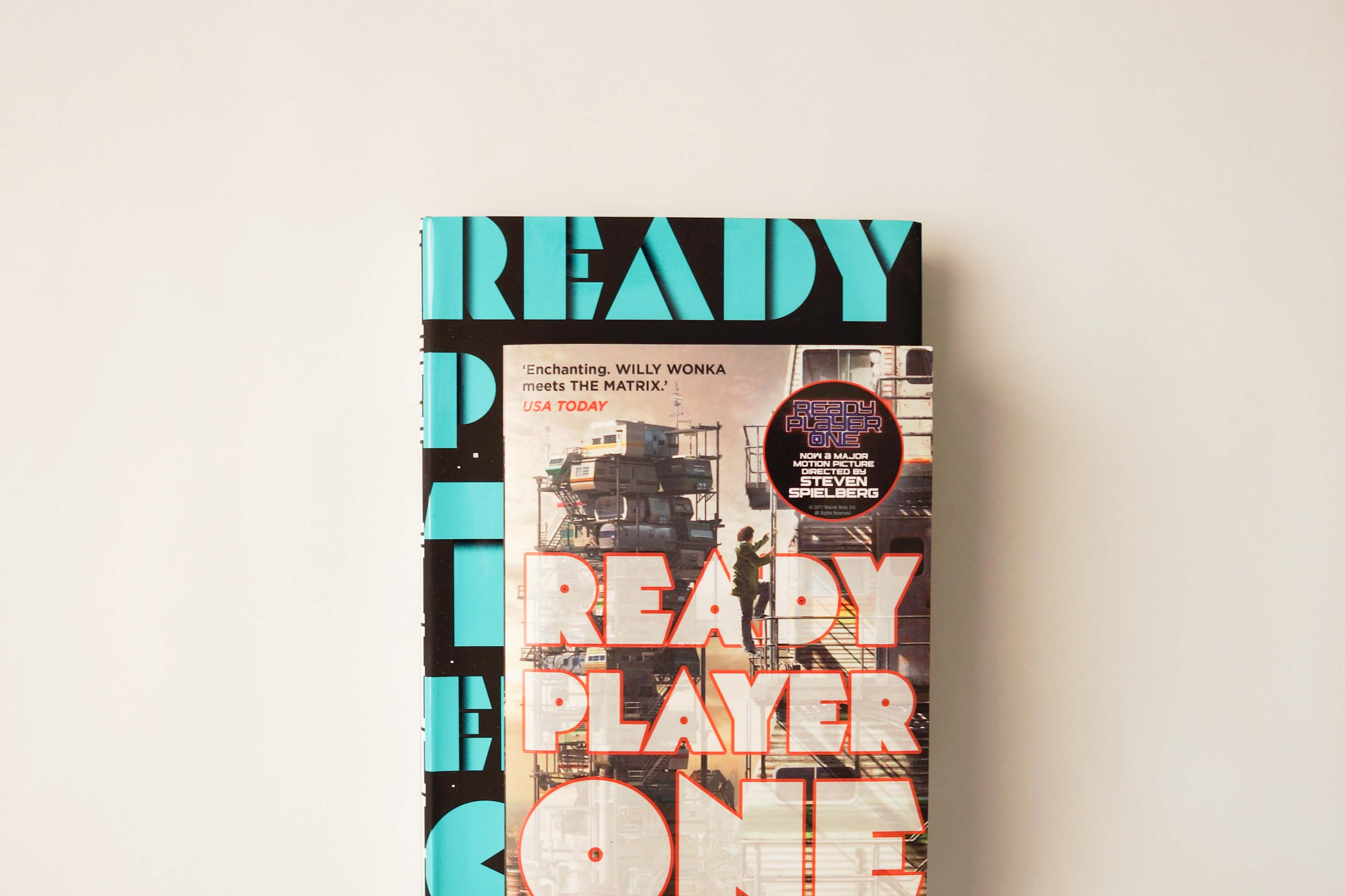
Mekon's distinctive geometric letterforms take centre stage on the covers of Ernest Cline's bestselling science-fiction novels, Ready Player One and Ready Player Two.
Ernest Cline's Ready Player One and Ready Player Two explore virtual worlds, gaming culture and the relationship between technology and reality. Their distinctive book covers capture this futuristic atmosphere through bold typography and striking visual compositions.
Mekon takes a prominent role in the cover designs, with its geometric construction and unconventional letterforms creating a strong visual identity across both titles. The oversized typography dominates the compositions, combining sharp angles, distinctive shapes and tightly arranged characters to produce an unmistakable science-fiction aesthetic.
The contrasting colour palettes and treatments demonstrate Mekon's versatility as a display typeface, bringing consistency to the two publications while allowing each cover to establish its own visual character.
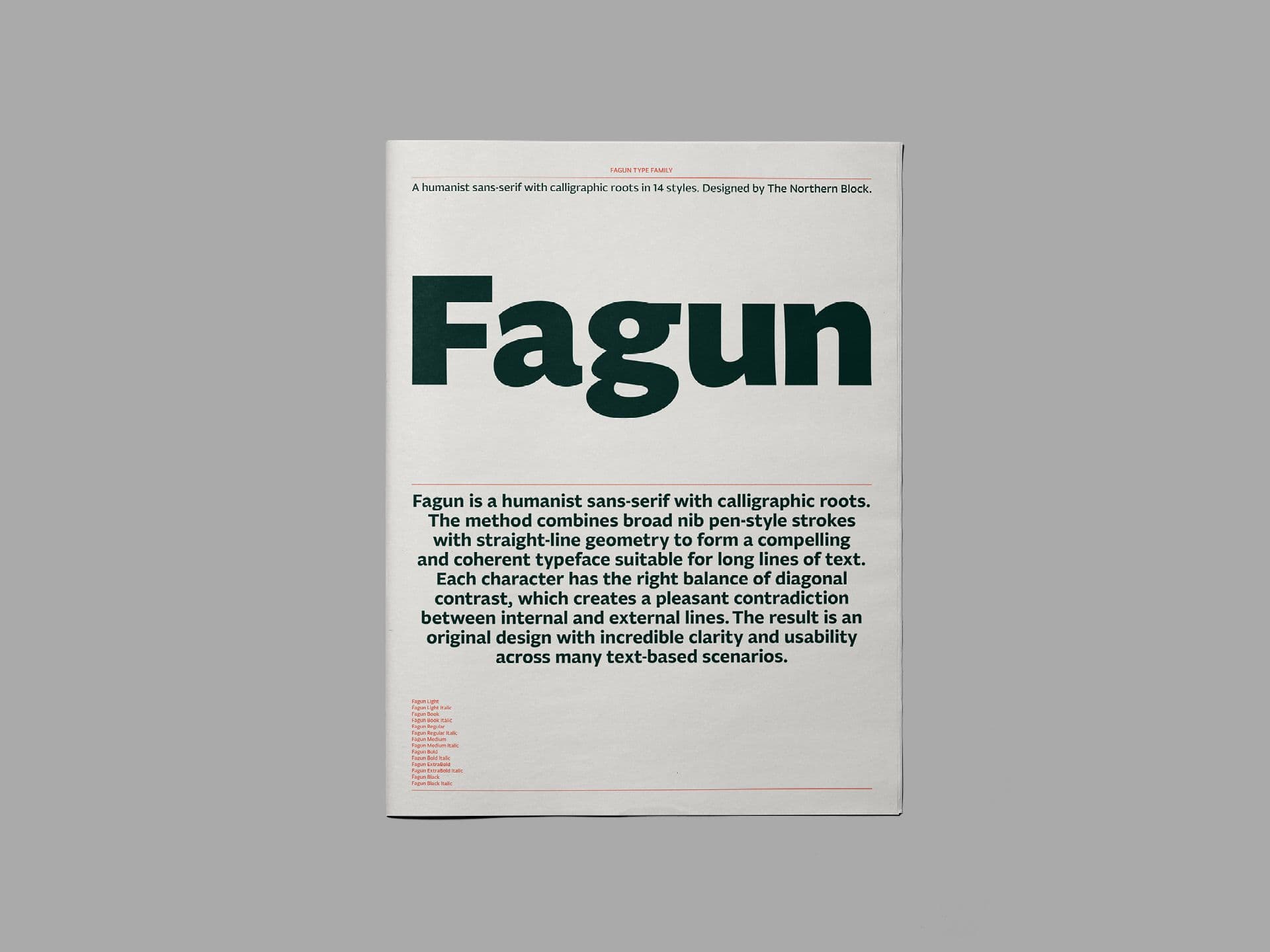
A 44-page newspaper specimen exploring Fagun's 14 styles and extensive typographic features, with a visual concept inspired by the novels and characters of Charles Dickens.
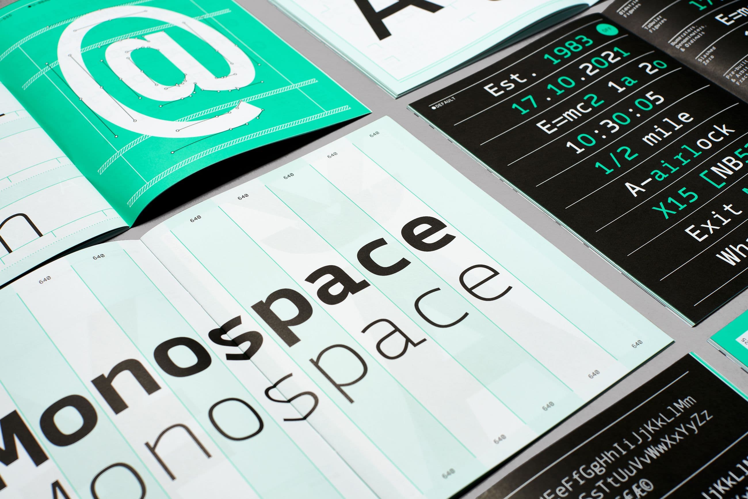
A 40-page printed specimen exploring Syke Mono's expanded family of ten styles, with a visual identity inspired by dot matrix printing and traditional continuous-feed paper.

Moret brings its expressive serif character to Squarespace’s Welcome to Winona campaign, adding warmth and personality to the brand’s distinctive visual storytelling.