INSPIRATION | 4 May 2023
Traditional American wood type provides inspiration for The Northern Block’s latest type family—Angusta.
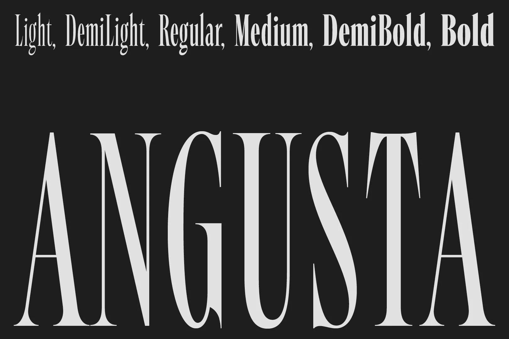
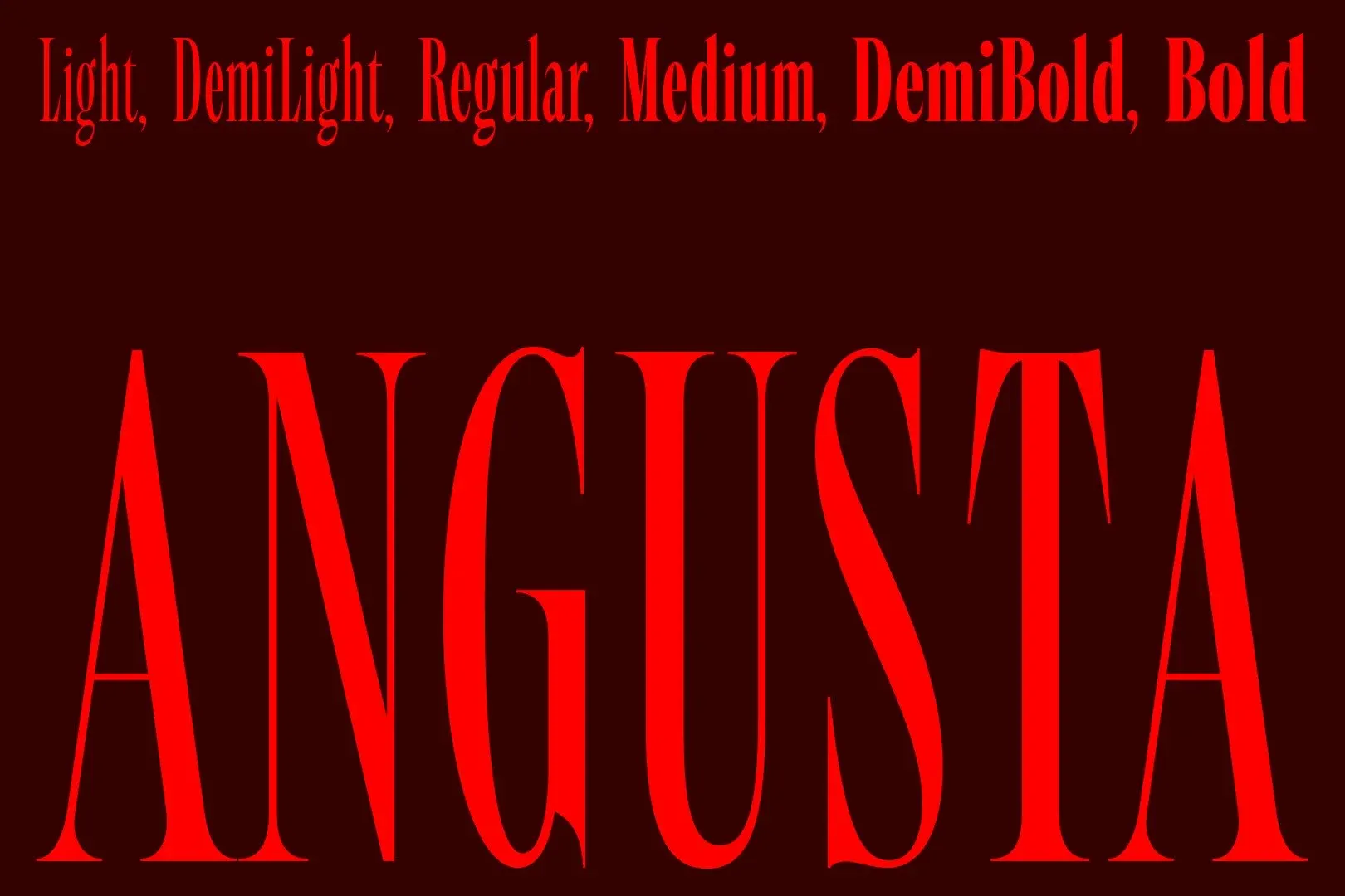
Tasos Varipatis merges the influence of 19th-century American wood type with a contemporary twist to create The Northern Block’s forthcoming typeface, Angusta.
Due for release later this month, and Tasos’ debut typeface for The Northern Block, Angusta is a condensed display serif type family. With a design rooted in traditional Roman letterforms, its dynamic transition between thin and thick strokes results in a sharp, legible and impactful font that offers an efficient and economical use of design space.
Tasos’ design approach often focuses on creating typefaces with a strong sense of character and personality, which he imbues with a distinctive style to make a lasting impact on the viewer. He is drawn towards creating practical typefaces, lending Angusta’s design to combine character with purpose. The result is a timeless and contemporary font that is aesthetically pleasing yet highly functional in various design contexts.
Here Tasos shares his story behind Angusta.
Can you introduce this project and the affinity you felt with Angusta?
The brief for Angusta was to create a condensed display serif font that would become highly legible and effective at large sizes, particularly in titles and headings. Angusta is intended for use in various display contexts, including print and digital media, so making it versatile and adaptable to different design needs was essential.
I am naturally drawn towards researching various periods and design movements. For Angusta, I studied the work of other type designers, particularly those who have successfully created condensed serif fonts.
Ultimately, the affinity I felt for Angusta was in its creative potential—producing a type family that was both aesthetically pleasing and highly functional. It was important for me to view Angusta as adding value to a creative’s toolkit by meeting their needs for a wide range of design projects. I believe the final result is a type family that is both timeless and contemporary.
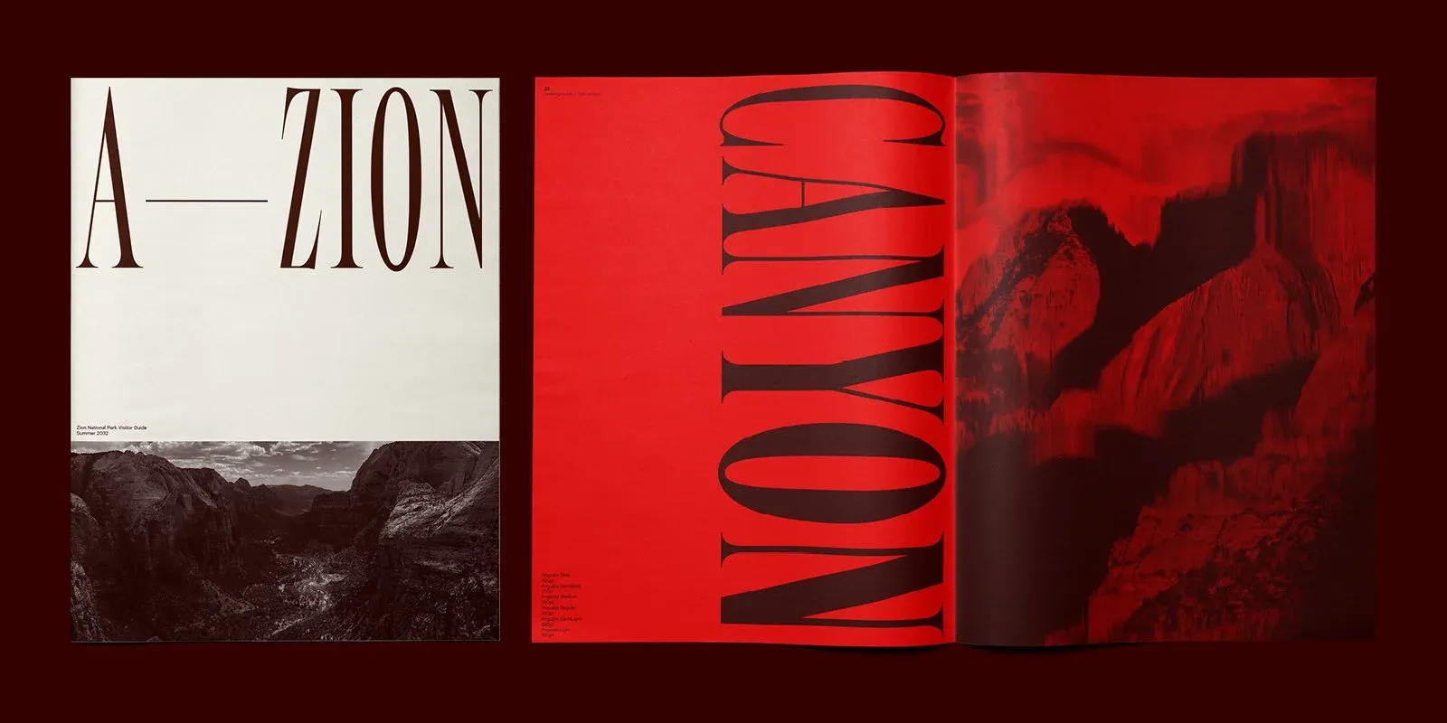
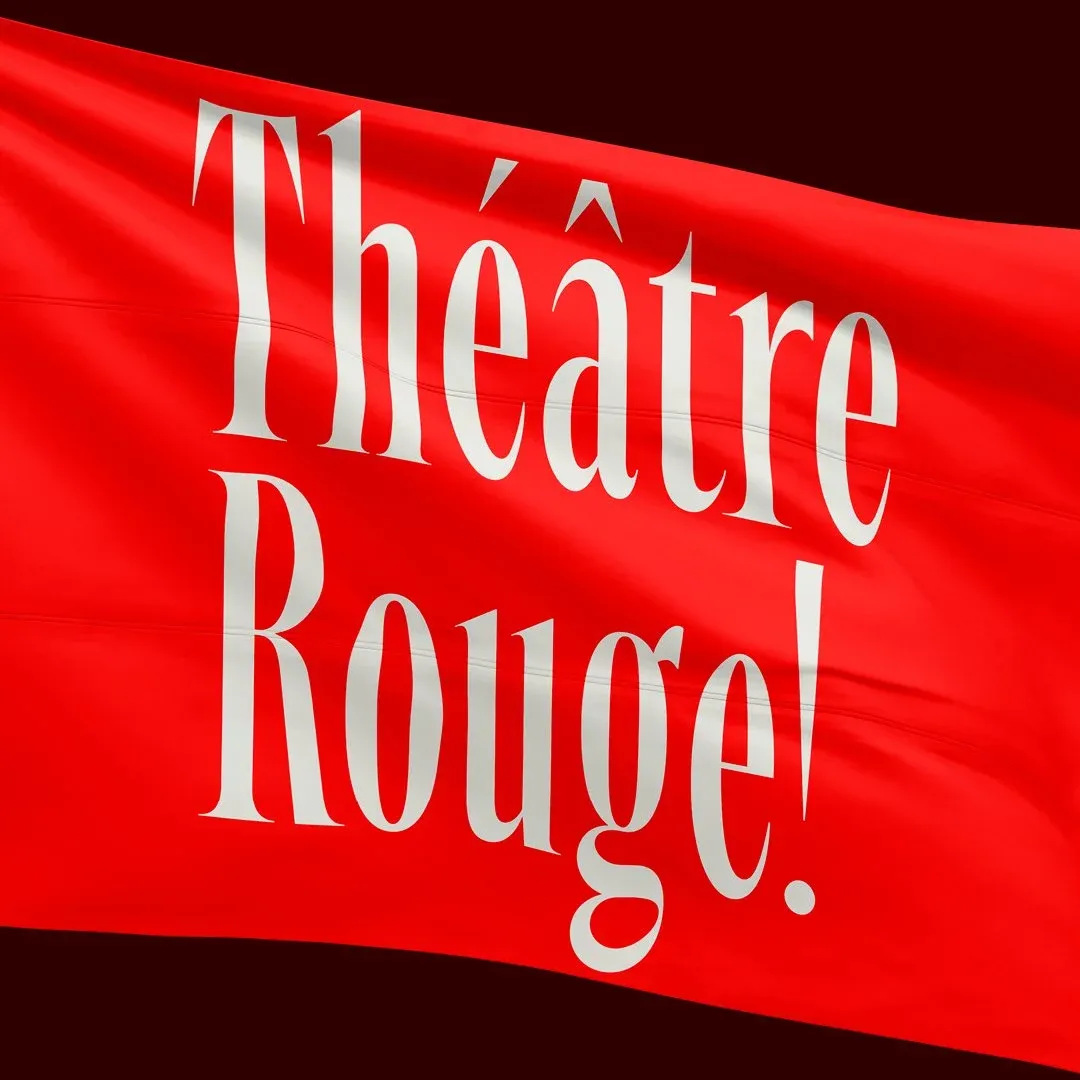
How and why did American wood type influence your design?
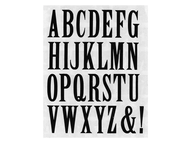
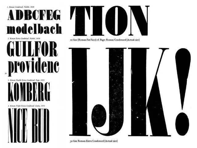
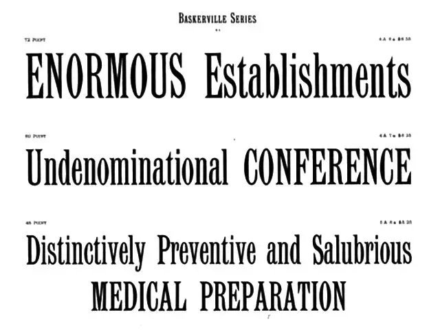
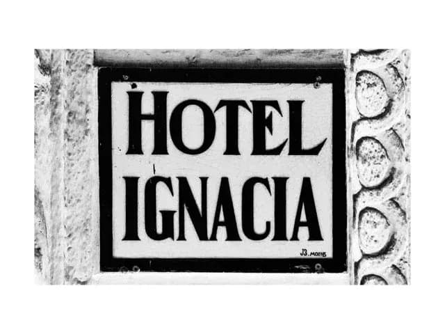
The inspiration for Angusta came from my love of the traditional American wood type of the 19th century and how it is used to create bold, eye-catching headlines. I wanted to create a typeface that retained the strong character and striking contrast of wood type yet had a modern twist, so I introduced thin serifs and played with the dynamic contrast between stroke thickness.
What drew you to this project?
One of the most exciting elements of this project was the opportunity to work with narrow proportions and explore their creative possibilities. I love how narrow letterforms can create a sense of elegance and refinement while allowing for more efficient use of design space.
Despite its narrow proportions, I was intrigued by the challenge of creating a typeface that maintained a strong sense of character with visual impact. I enjoyed the process of experimenting with different stroke widths and serif styles to find the perfect balance between simplicity and complexity—and I am thrilled with the final result!
Angusta has challenged me as a type designer, and I am excited to see how this typeface will be used in the real world and its contribution to the ongoing evolution of typography.
How did the name Angusta come about?
The name ‘Angusta’ was inspired by the Latin definition of the term that fully describes the design’s characteristics and features: narrow, steep and confined.
What makes Angusta different to other typefaces?
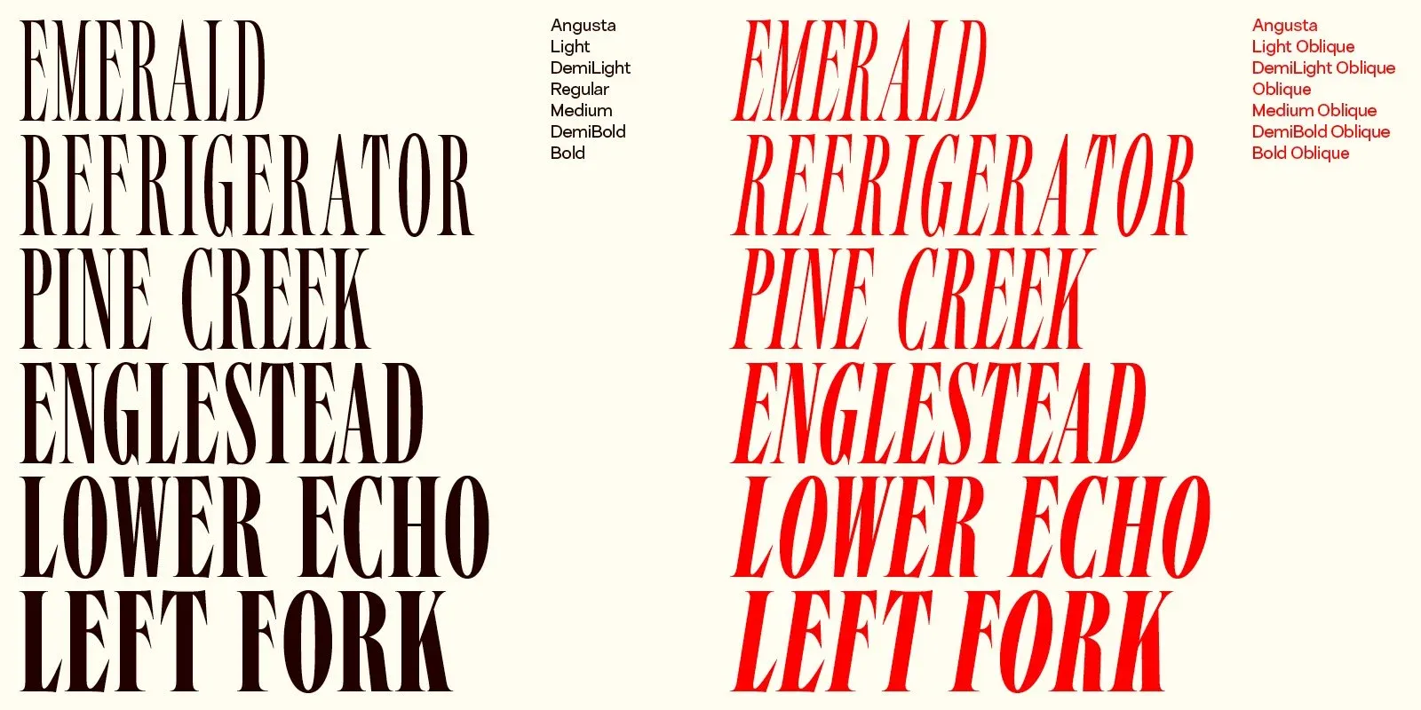
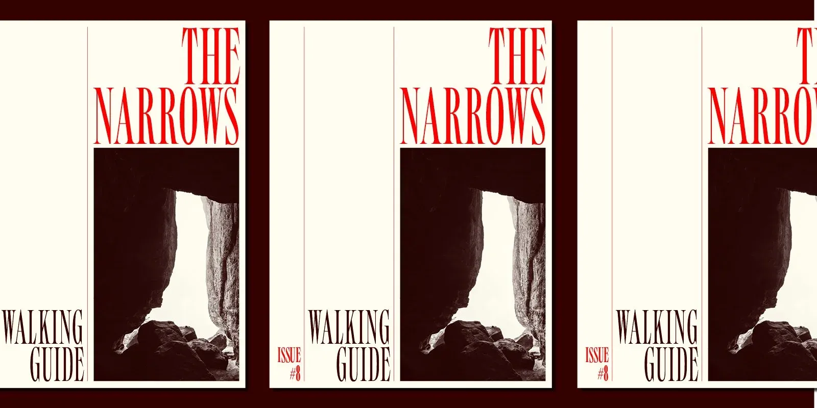
In contrast to typical bold, round, old style serifs, the very thin serifs give a sharp, dynamic character to the entire typeface. At the same time, its narrow proportions make it versatile and adaptable to different design needs, including titles, large headlines, print and digital media.
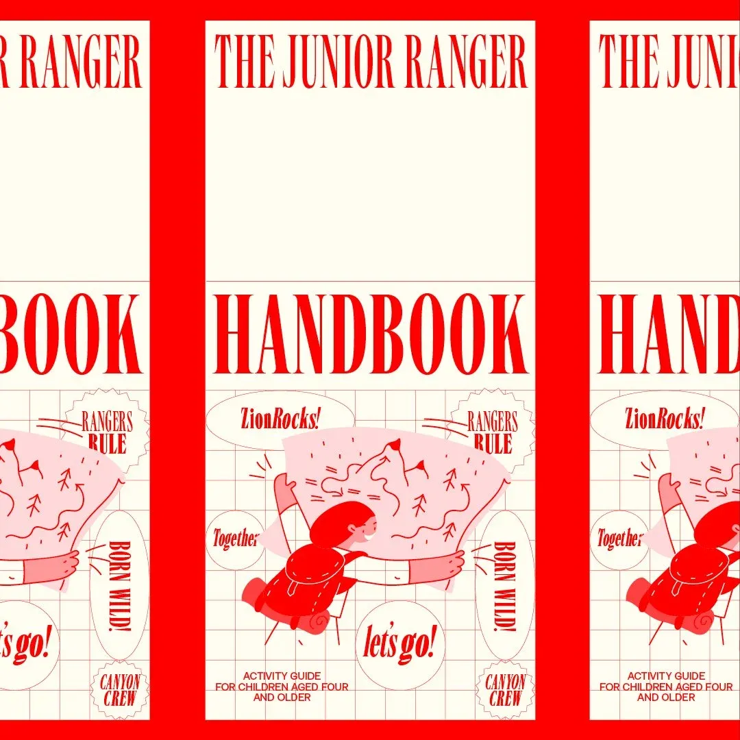
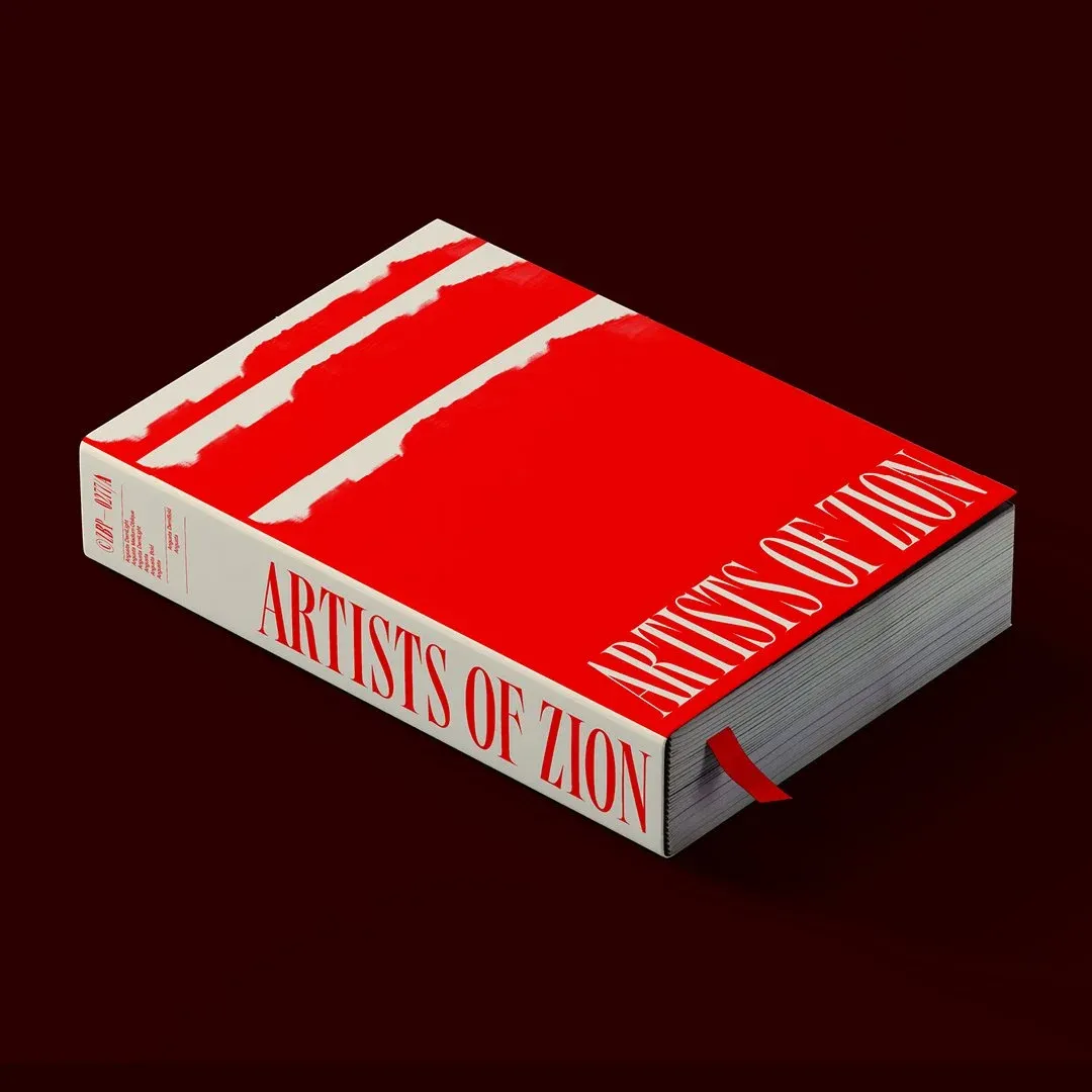
Angusta has six weights with matching obliques and contains over 400 characters per style. OpenType features include inferiors, superiors, fractions, tabular and lining figures, and language support for Western, Southern, and Central Europe.
Sign up to our newsletter to receive exclusive discounts on new releases.
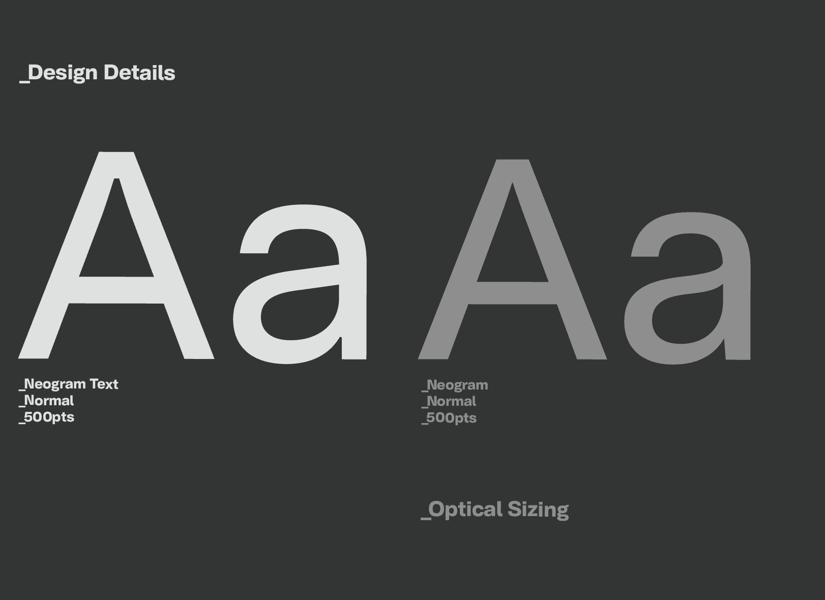
Neogram Text refines the character of the original Neogram for sustained reading, with carefully considered proportions, spacing and details focused on clarity and information.
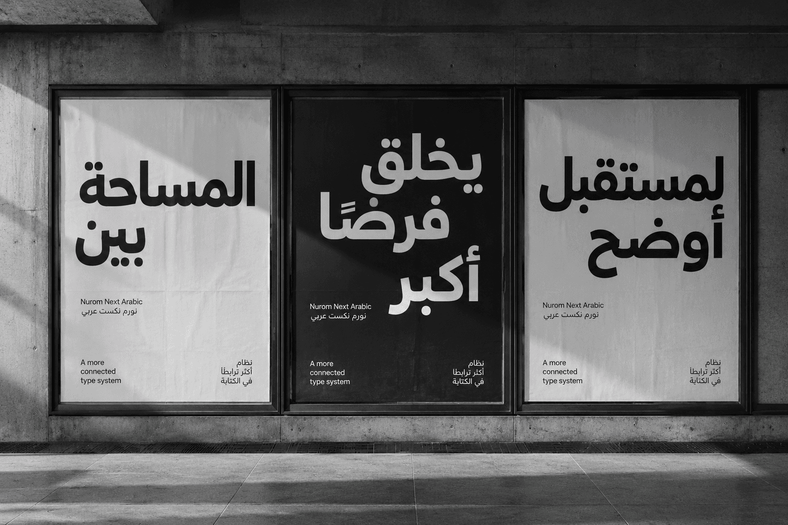
Nurom Next Arabic: Translating cultural harmony & human connection, through global communication
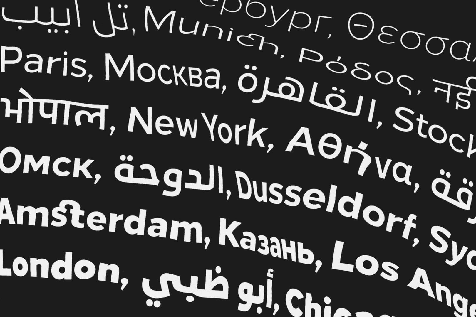
Diversifying design, enabling evolution and mastering universal communication. — The story of The Northern Block’s ‘Next Series’.