RELEASES | 13 March 2025
Loew Next Devanagari—An evocative global typeface for the rising global superpower that is India.
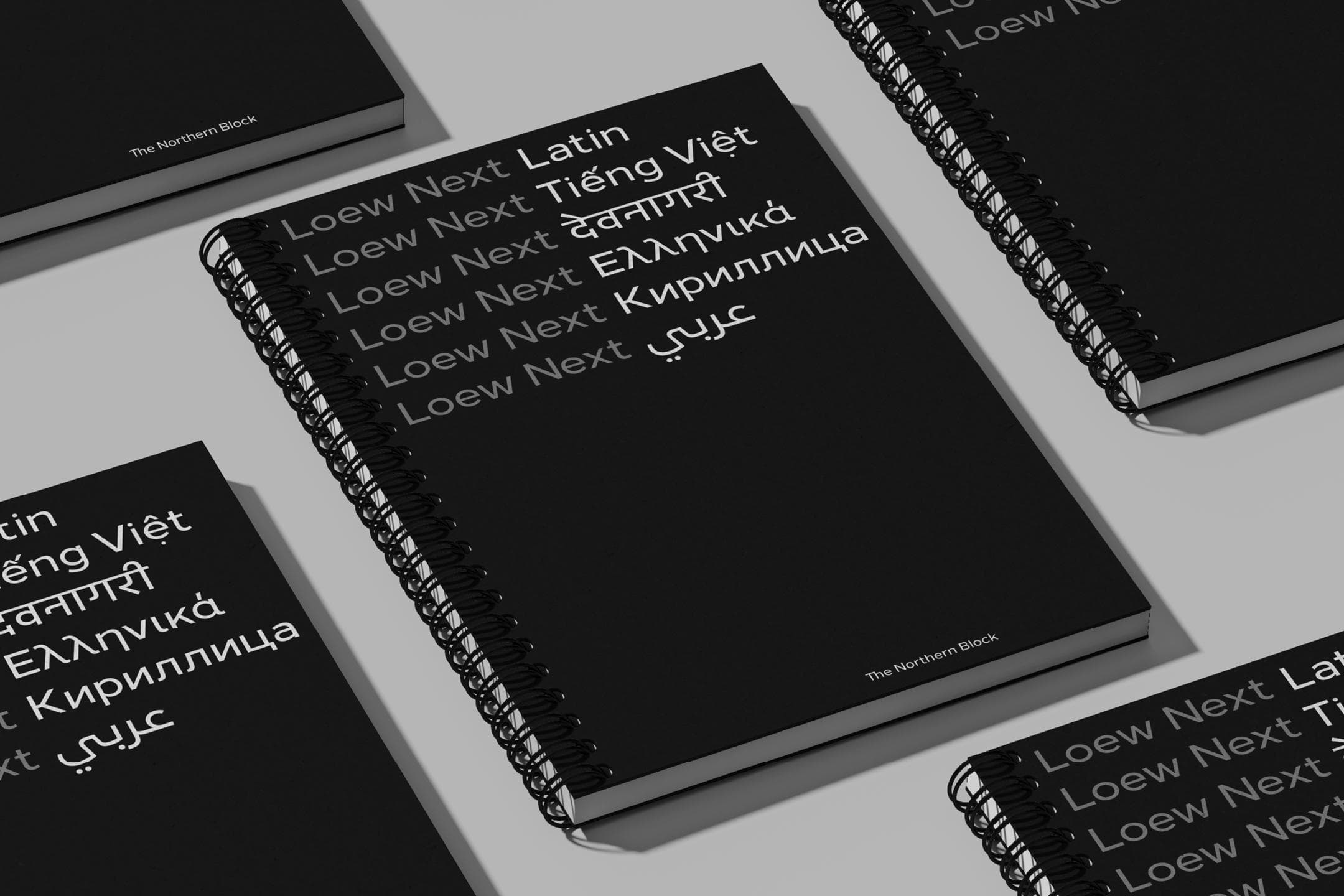
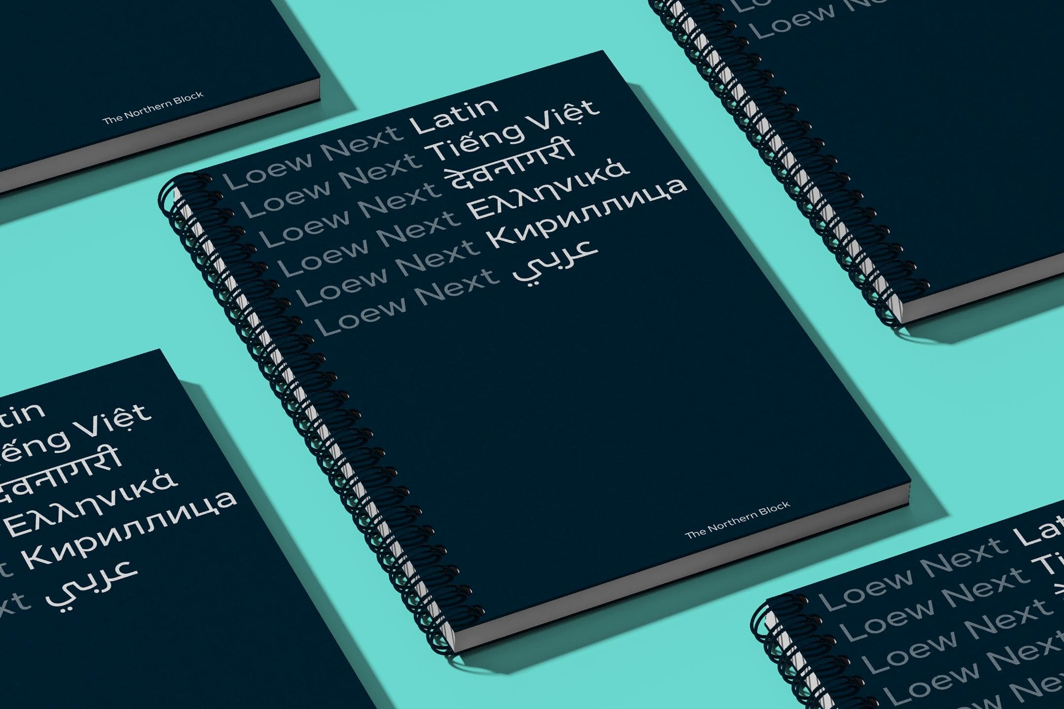
For The Northern Block, their Loew typeface was groundbreaking. It has built a lineage over a decade of delivering corporate regularity, of unifying messages and of bridging cultures. It has connected designers and customers around the world.
‘It was the best gift we never knew we needed. It brought us together as a foundry. It gets through armour and into heartstrings. People see it, feel it, and just want to do something good with it.’—Jonathan Hill, Founder, The Northern Block.
Evocative, groundbreaking design will always find its opportunity to step across the threshold into Devanagari. For the Loew typeface, that opportunity would come a whole decade from its original launch. A refinement into Loew Next has allowed the typeface to be more compatible, and support a more diverse reach of languages. Evolving technology has also aided the opportunity to connect Loew, Devanagari, and the audiences that will go on to discover it. Software brings the script to life, and coding has made it more accessible and applicable.
‘It has taken ten years to find the right person and the right time. The right person was always going to be Amélie, who knows the processes involved, and is a pleasure to work with.’—Jonathan Hill
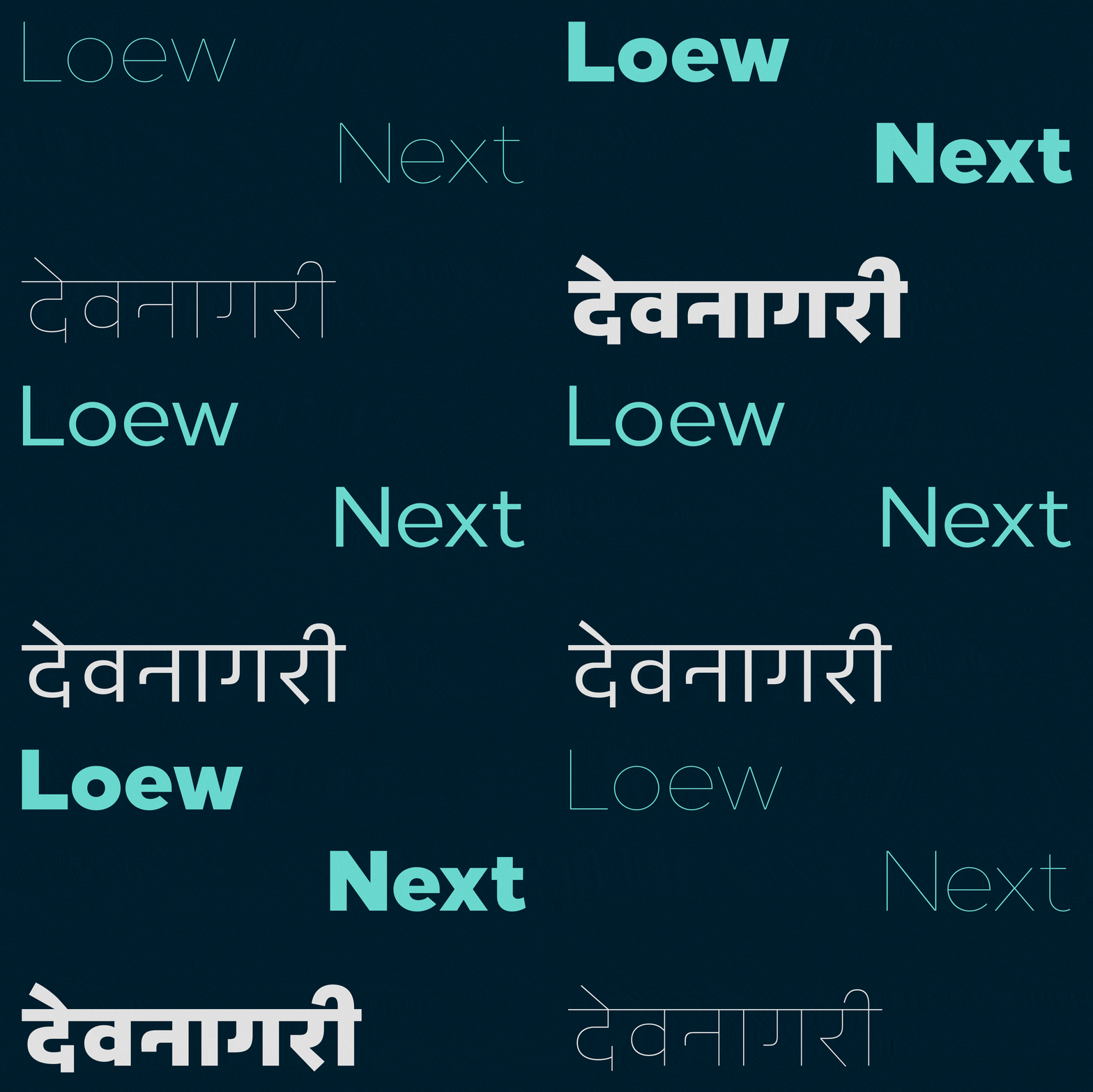
Devanagari has always been a potential Achilles heel for any typeface. It takes a lot of artistry to avoid congestion, and Loew Next needed to be tempered and balanced to retain its features. It needed to be right, and designers with the right skill set and a passion for Devanagari, are not easy to find. Amélie Bonet feels pre-ordained for the task of designing Loew Next Devanagari. A designer with her own lineage in developing Western typefaces into Indian scripts. While working for Dalton Maag, she delivered a Bengali typeface for Nokia, which is still remarkable to this day.
Amélie’s passion for Devanagari began while studying type design at Reading and deepened during trips to SOAS on Russell Square, where she explored scripts from the Indian subcontinent as part of her research for her first Devanagari typeface. After graduation, she spent three months in India, experiencing its rich typographic landscape firsthand. Her idealised vision of India became more nuanced as she commuted by bus to Haus Khas in Delhi and later led Graphic Design workshops at the National Institute of Design (NID) in Ahmedabad, Gujarat.
An hour-long conversation with someone as knowledgeable about Indian script design as Amélie reveals that integrating an average typeface with Tamil or Bengali presents different challenges than adapting a distinct design like Loew Next into Devanagari. The process isn’t just about translation—it’s about reimagining the essence of the typeface within the structure and aesthetics of Devanagari.
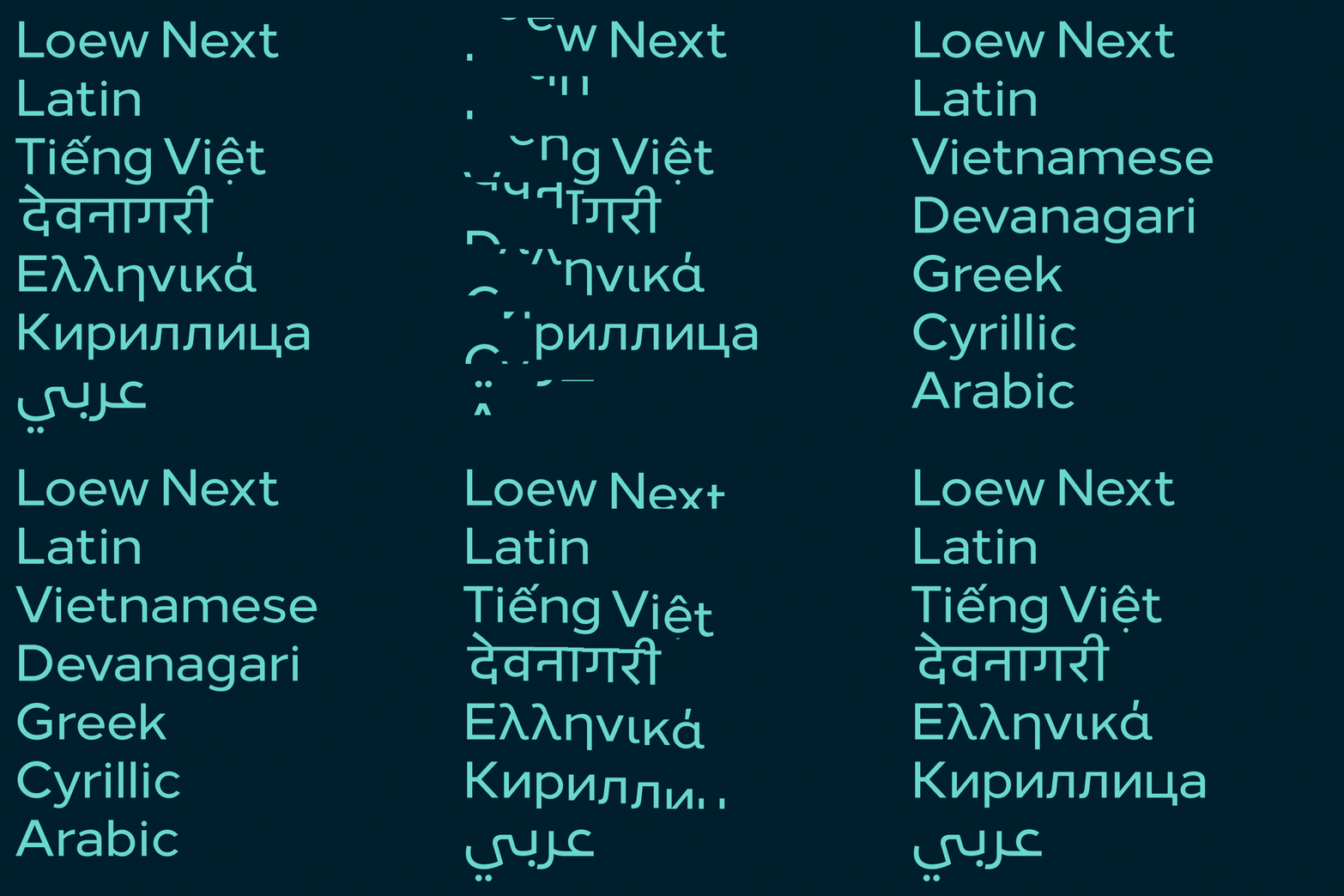
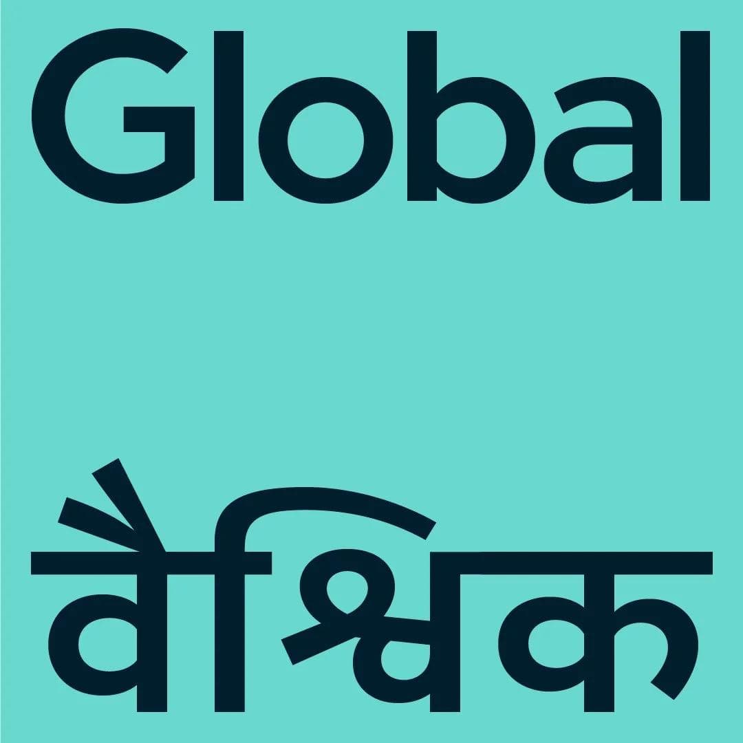
A decade to reach the right moment, and it would take Amélie eighteen months to make that moment a success. Eighteen months of intense intricacy. A feat of focus and attention to detail that’s made even more inspirational, when you learn it was managed while caring for the three toddlers that were running around Amelie’s ankles—a feat that probably isn’t honoured enough, in creative industries.
For Amélie, the first step in making the shapes of Devanagari and Loew Next Latin coincide, was the analysis and matching of the letter proportions. It’s a design process, going from the very large to the very small. It all starts at the broadest level; the proportions—before getting closer, working on the weights, and finally, the details.
‘The base design can often be painful, with the first stage of playing with proportions going back and forth with the consultants, and the design of a few glyphs from each group of vowels, then consonants.’—Amélie Bonet, designer of Loew Next Devanagari.
That strong consultancy base was delivered by Erin McLaughlin and Pooja Saxena, who both provided support that was vital to bind the Latin, with the intricacies and complexities of Devanagari. They’d bounce glyph detail and proportion back and forth, challenging the work, and strengthening the result of this project.
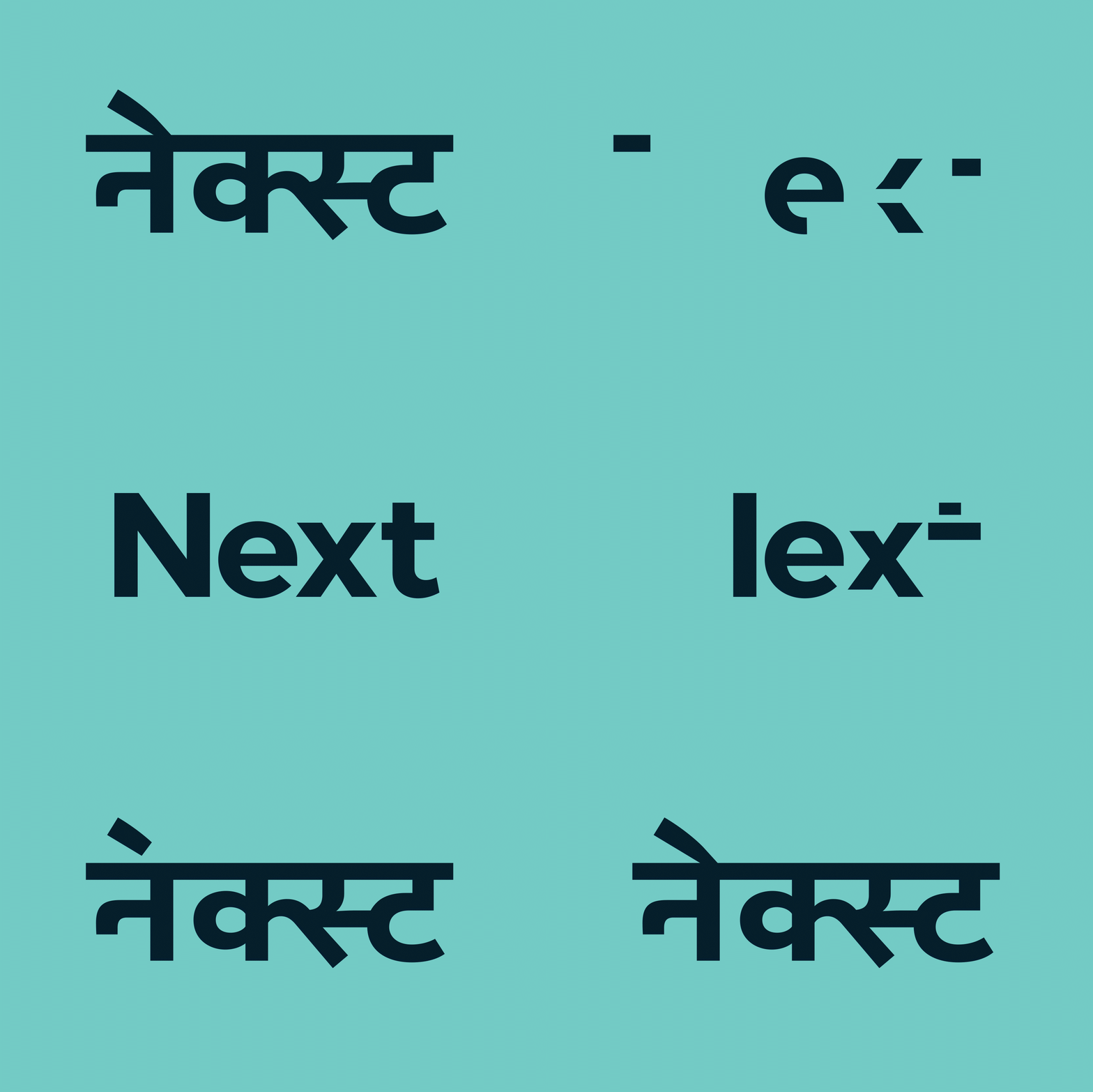
This was not Amélie’s first Devanagari project, but the typeface made this an assignment with a difference. With Loew, the optical rules are not standard. It creates an obvious tension, when the task is to build a Devanagari twin. Loew Latin is very particular and very wide, because there is no height modification when the weight changes. It’s a feature that has helped to distinguish Loew, and contributed to its success. It also enables better performance from the typeface as a web font. It wasn’t comfortable territory for Devanagari, and made for a challenging project for Amélie, but once the design began to fall in place, the logic made this project run. As a result, you won’t find many, if any, examples of a Devanagari typeface that are this well executed, while retaining height through each weight.
‘India is a design detox. It heals. Maybe westerners can’t put a finger on it, but they feel it. There’s a vibrancy, a sympathy and an understanding.’—Jonathan Hill
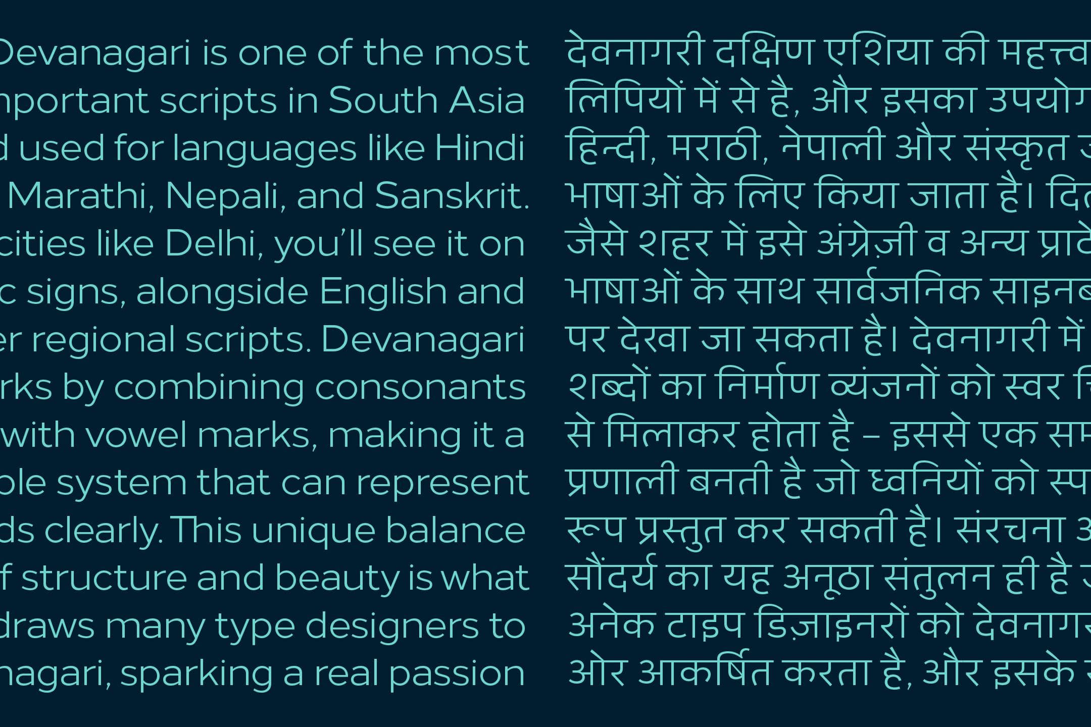
Devanagari is one of the most important scripts in South Asia, used for languages like Hindi, Marathi, Nepali, and Sanskrit. In cities like Delhi, you’ll see it on public signs, alongside English and other regional scripts. Devanagari works by combining consonants with vowel marks, making it a flexible system that can represent sounds clearly. This unique balance of structure and beauty is what draws many type designers to Devanagari, sparking a real passion for working with the script.
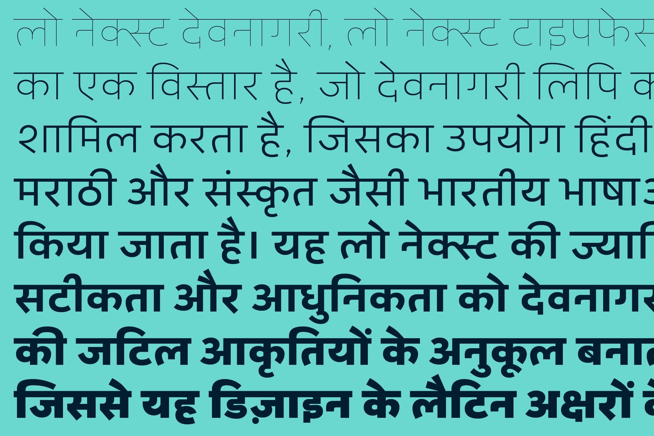
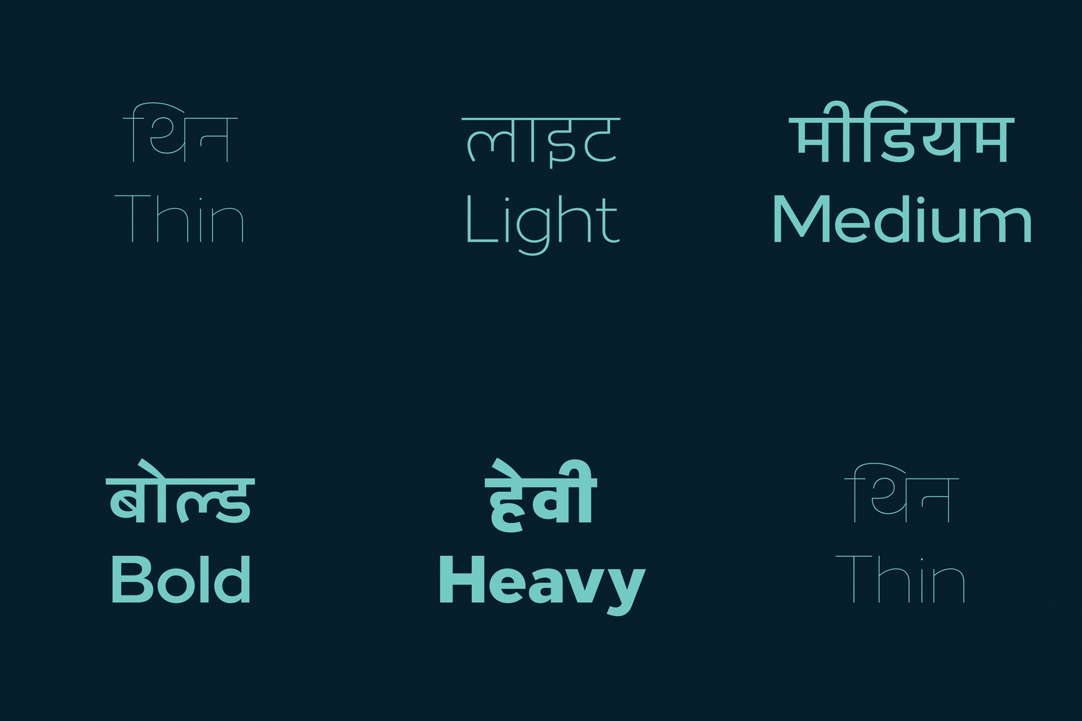
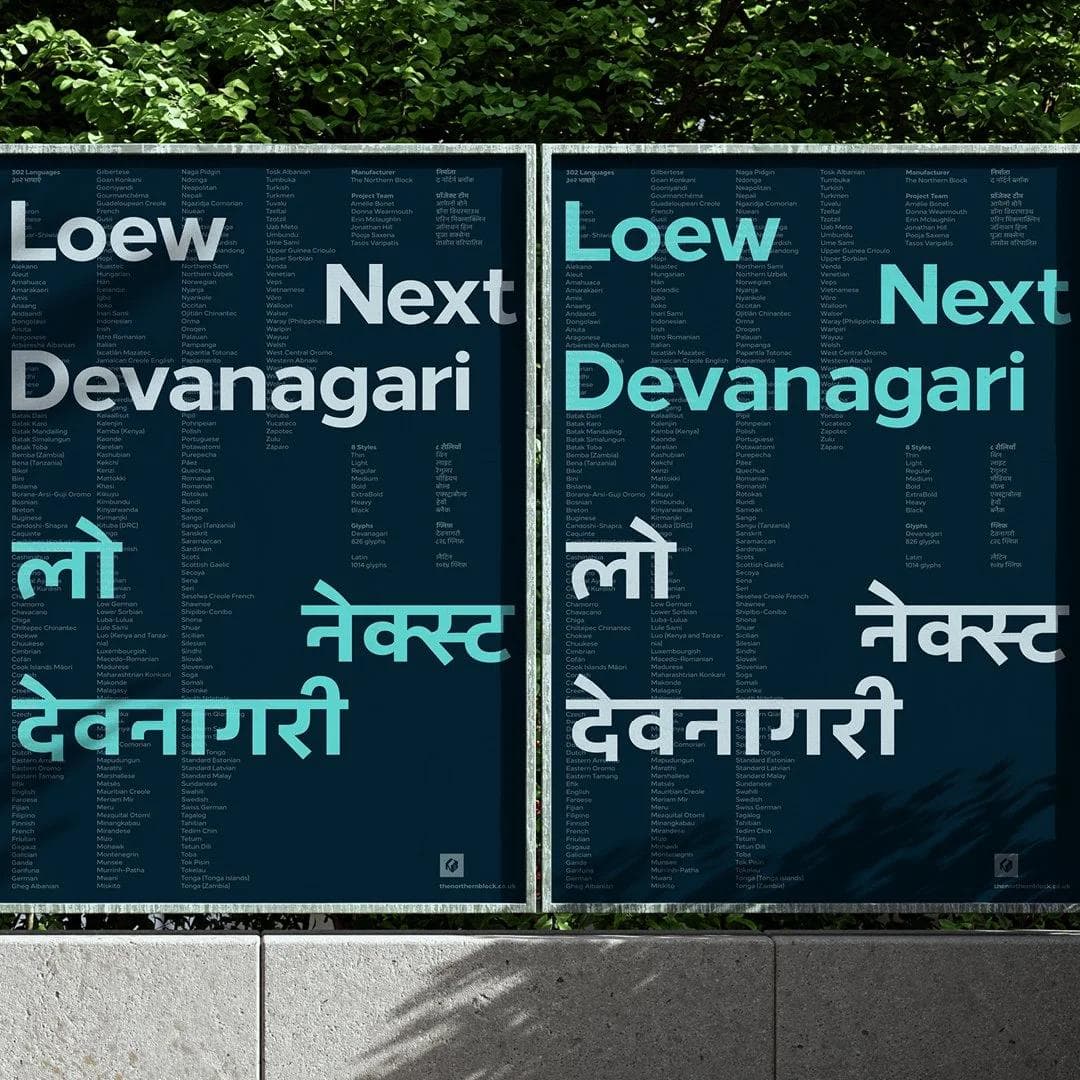
It’s been over fifteen years since Amélie first discovered her interest in Devanagari, and the motivation to keep working with, and to do justice to the Abugida script itself, is still obvious in her work on The Northern Block’s commission. The journey of creating Loew Next Devanagari, was often an act of surgery led by instinct. Some forms are moved, grafted from one glyph to the next. Amélie had to choose which glyphs to adapt, and which ones to leave behind, marrying conjuncts and crafting vowel sounds into shapes that carry Loew’s DNA.
‘Devanagari captures sounds that Latin does not. It’s a passion for working with unfamiliar shapes, and the distance that gives you, allowing for creativity to come into play. Because you have a different relationship with Devanagari, you get to work with and in the abstract, in a way that is really joyful.’—Amélie Bonet
Loew is a project that continues to grow in magnitude, and keeps surprising. Hilton showed what could happen to a typeface as it makes its way emblazoned across the world. Font development and brand managers who are part of Loew’s history have been able to make it a globally expansive language system beyond its intent. Loew has become a visual language that speaks in many places, and now India, too.
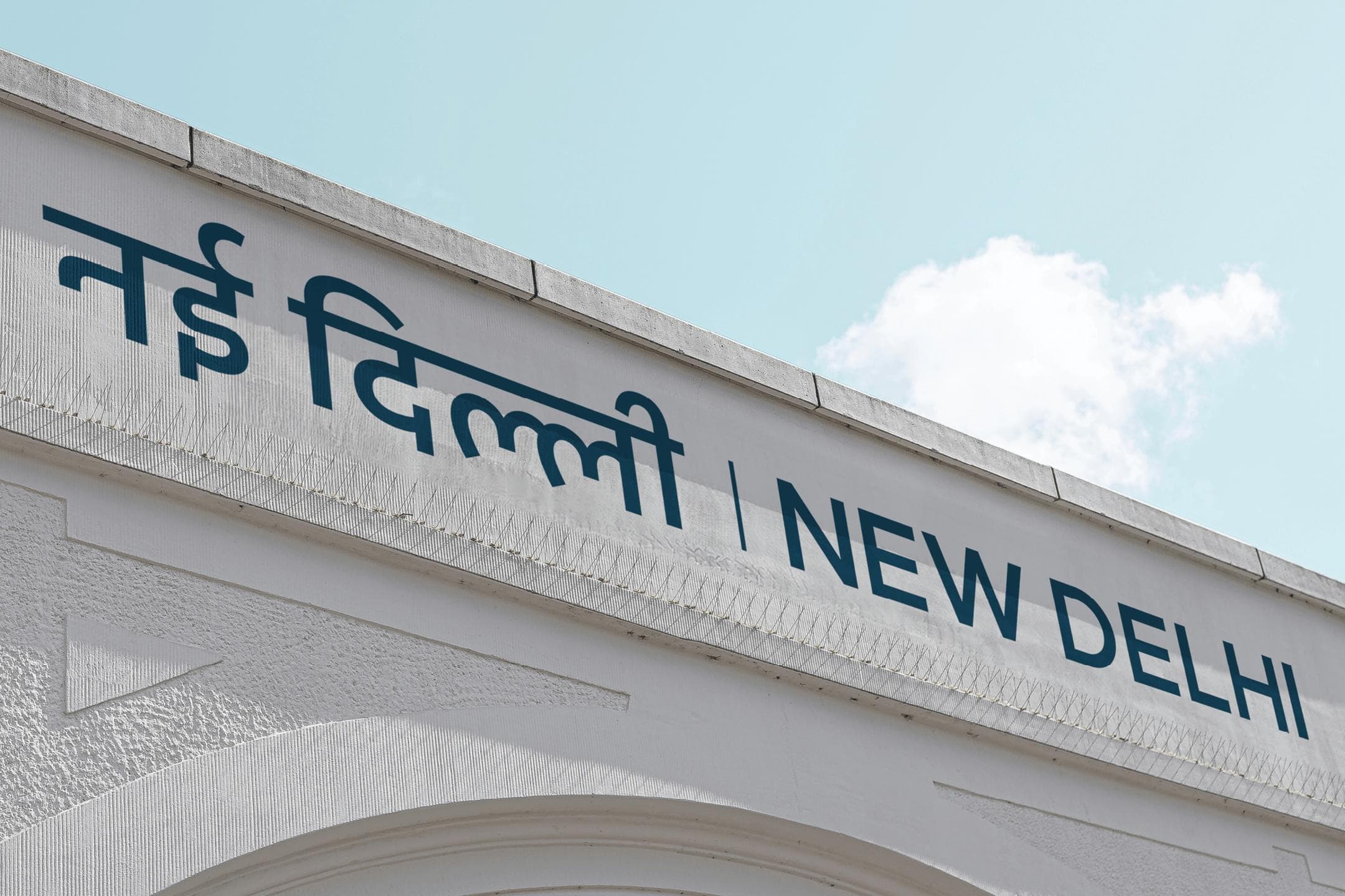
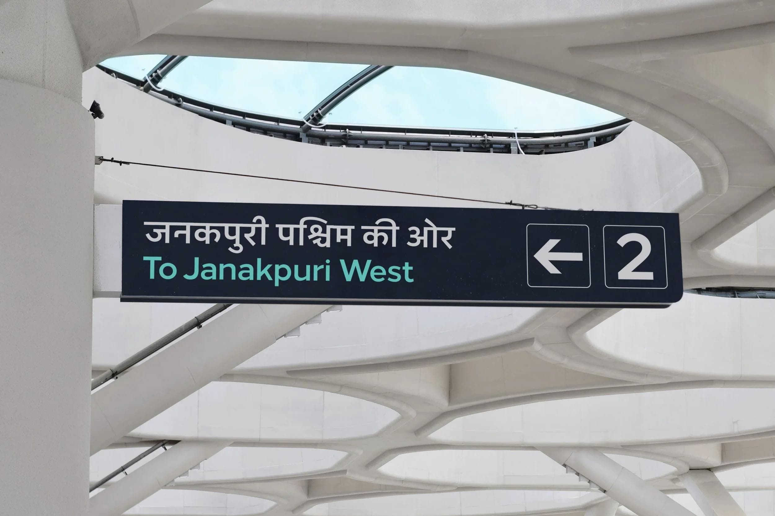
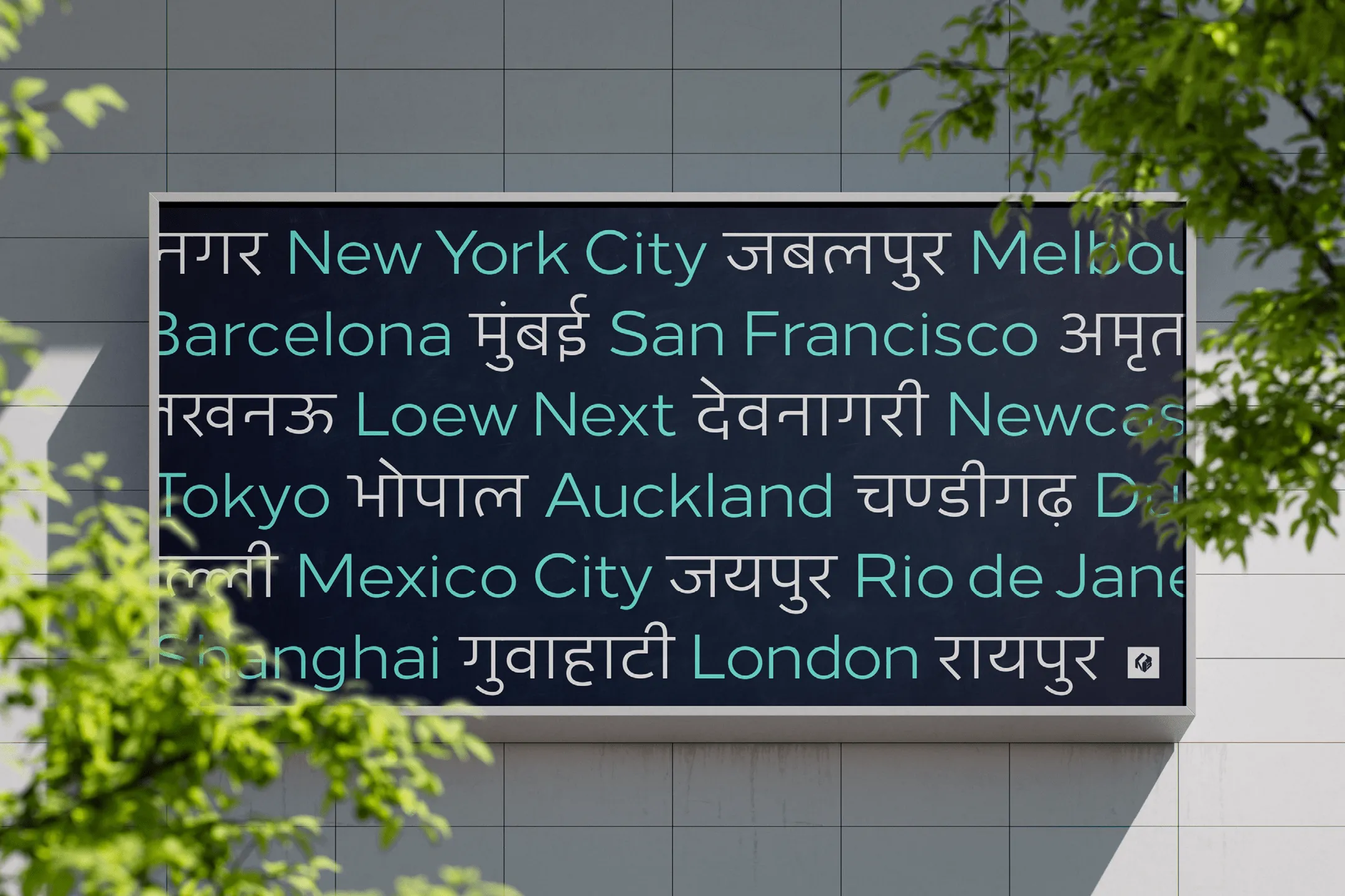
Fictional usage of Loew Next Devanagari
We’re not just talking about the India of autorickshaws, yoga retreats, and bustling spice markets. Today’s India is rapidly evolving—since the launch of the Loew typeface, the country has seen significant infrastructure growth, including a sharp rise in the number of airports. In 2023, India became the first nation to successfully land a spacecraft near the moon’s south pole. It’s the India of TATA, Titan watches, and Infosys—a nation poised to become a major global superpower, with ambitions of rivaling the US economy by 2047. As the IMF describes it, India is a ‘connector country,’ bridging East and West in the liberalisation of trade.
In that sense, India’s evolution has synced nicely with the development of Loew Next Devanagari. The bridge is open, and the terminus on the other side is growing. Unlike the bridge into some cultures, there are no government regulations that stifle or ringfence what can be designed in India, and there is a democratic freedom of expression that allows brands, culture and economic voices to express themselves and apply expressive design to do so.
How the West feel about Loew, can now be felt by India. Loew is there to be listened to. If it could speak in every language, it would say, ‘Do it this way.’ Loew Next Devanagari has a chance at immediate recognition, and to offer an enriched user experience. By connecting its designers and customers, it has the power to charm Indian heartstrings, too. Which is the reason The Northern Block do what they do.
Project Team
Type Designers: Amélie Bonet and Jonathan Hill
Devanagari Consultants/Translators: Erin Mclaughlin and Pooja Saxena
Graphic Designer: Donna Wearmouth
Motion Graphics: Tasos Varipatis
Copywriter: Daniel Clarke (The Word Garden)
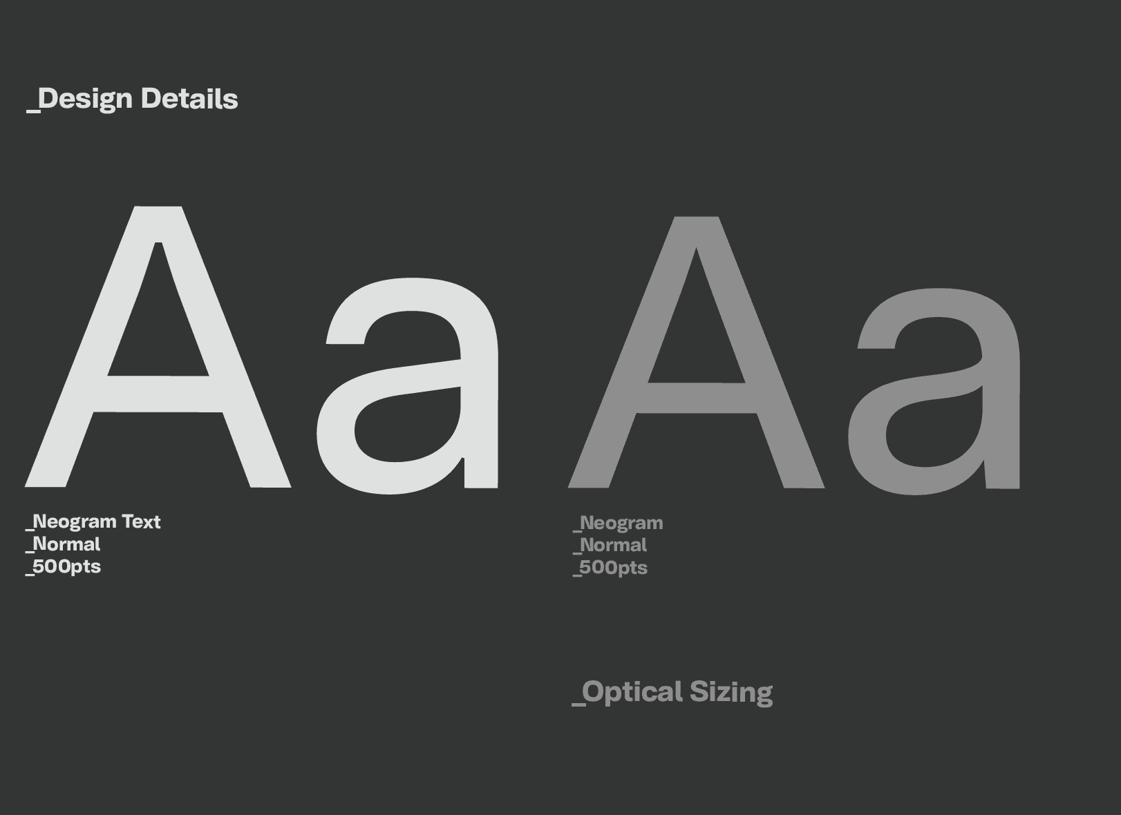
Neogram Text refines the character of the original Neogram for sustained reading, with carefully considered proportions, spacing and details focused on clarity and information.
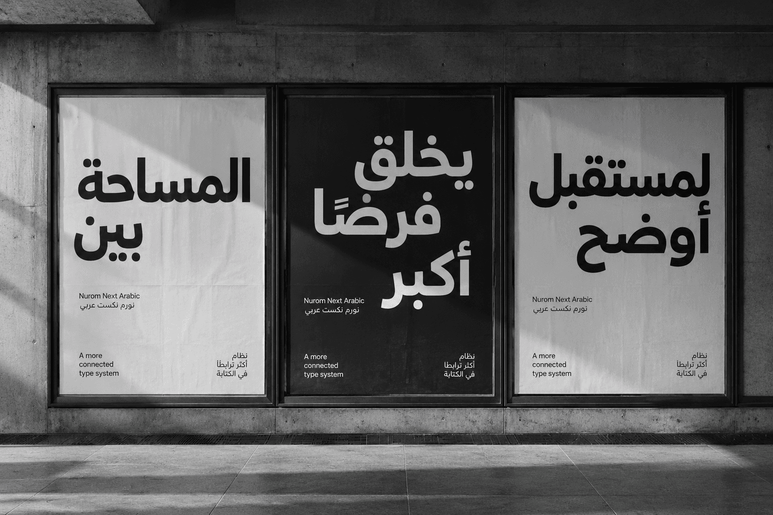
Nurom Next Arabic: Translating cultural harmony & human connection, through global communication
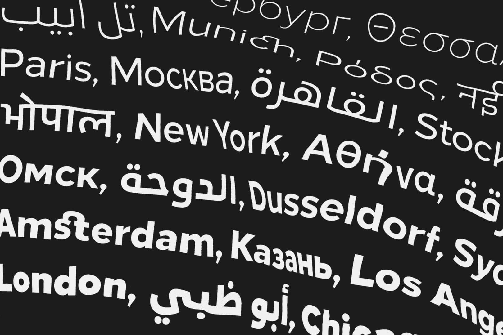
Diversifying design, enabling evolution and mastering universal communication. — The story of The Northern Block’s ‘Next Series’.