RELEASES
Cyntra: A Different Balance
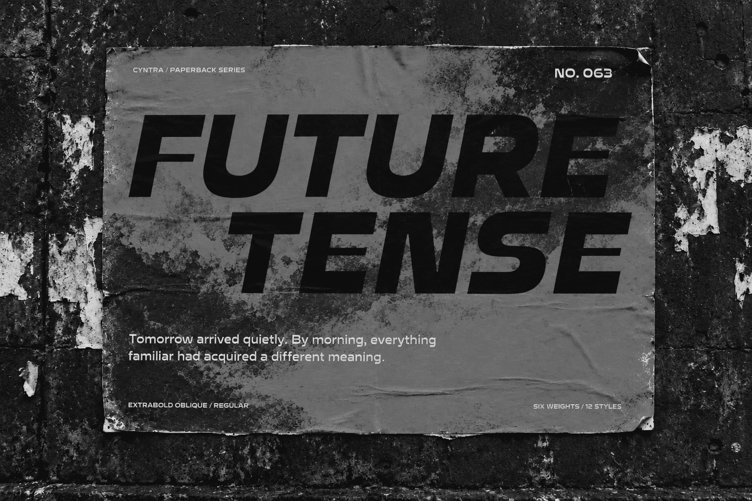
Cyntra takes its cues from Syntax and science fiction, reversing familiar stroke contrast to create a distinctive display family in six weights with matching obliques.
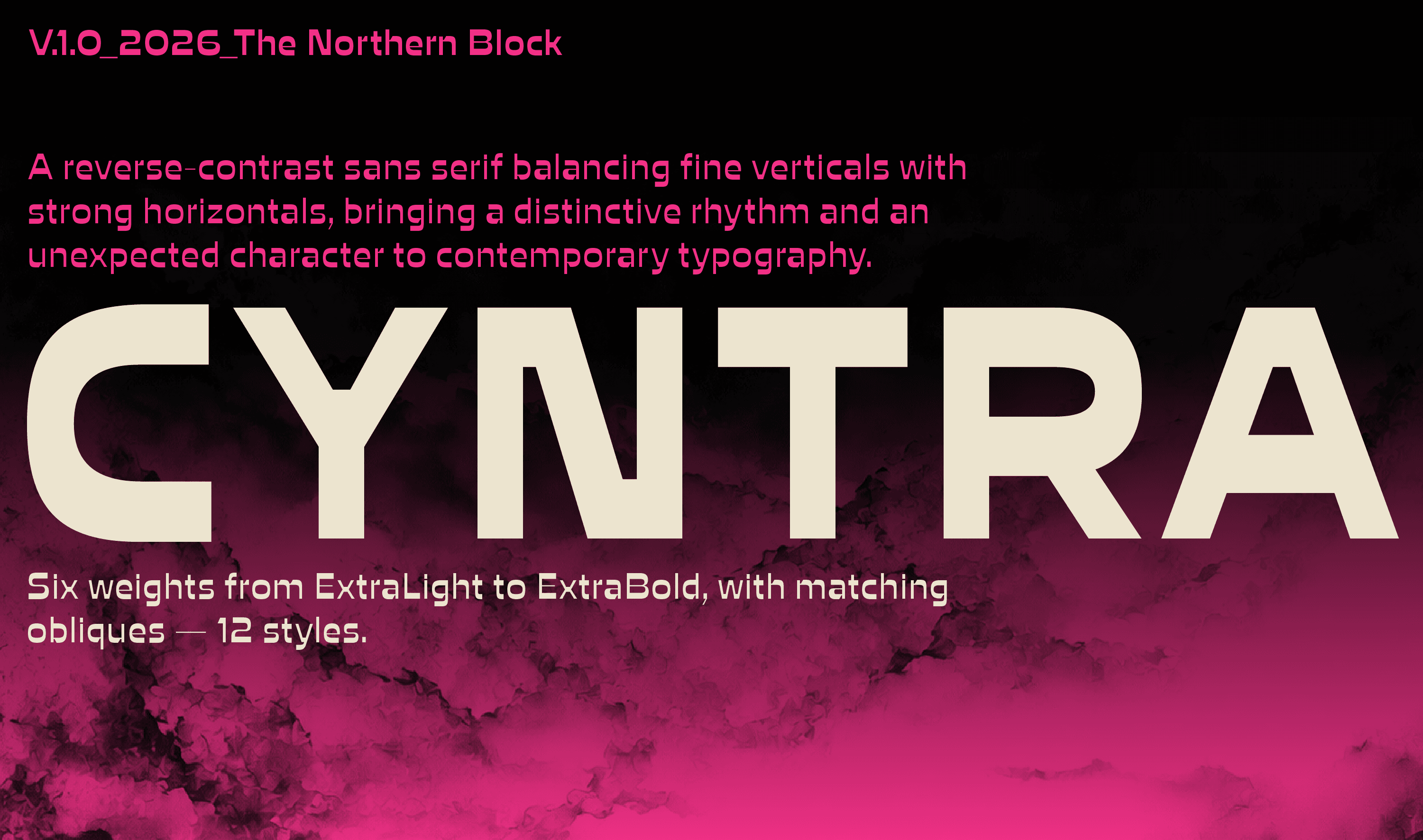
Cyntra brings an unfamiliar rhythm to familiar letterforms. A reverse contrast display family in six weights with matching obliques, it combines a distinctive construction with alternatives that allow individual words to change character.
Cyntra began with an interest in Syntax and the possibility of taking its letterforms in a different direction. Syntax also informed the name, giving Cyntra a connection to its starting point.
Reversing the stroke contrast offered a way to explore that relationship. Fine vertical strokes meet emphatic horizontals, shifting the balance of familiar forms and creating an unexpected rhythm across a word.
An interest in science fiction accompanied this exploration: the idea that something recognisable can feel unfamiliar when its usual rules change. In Cyntra, that shift happens within the letters themselves.
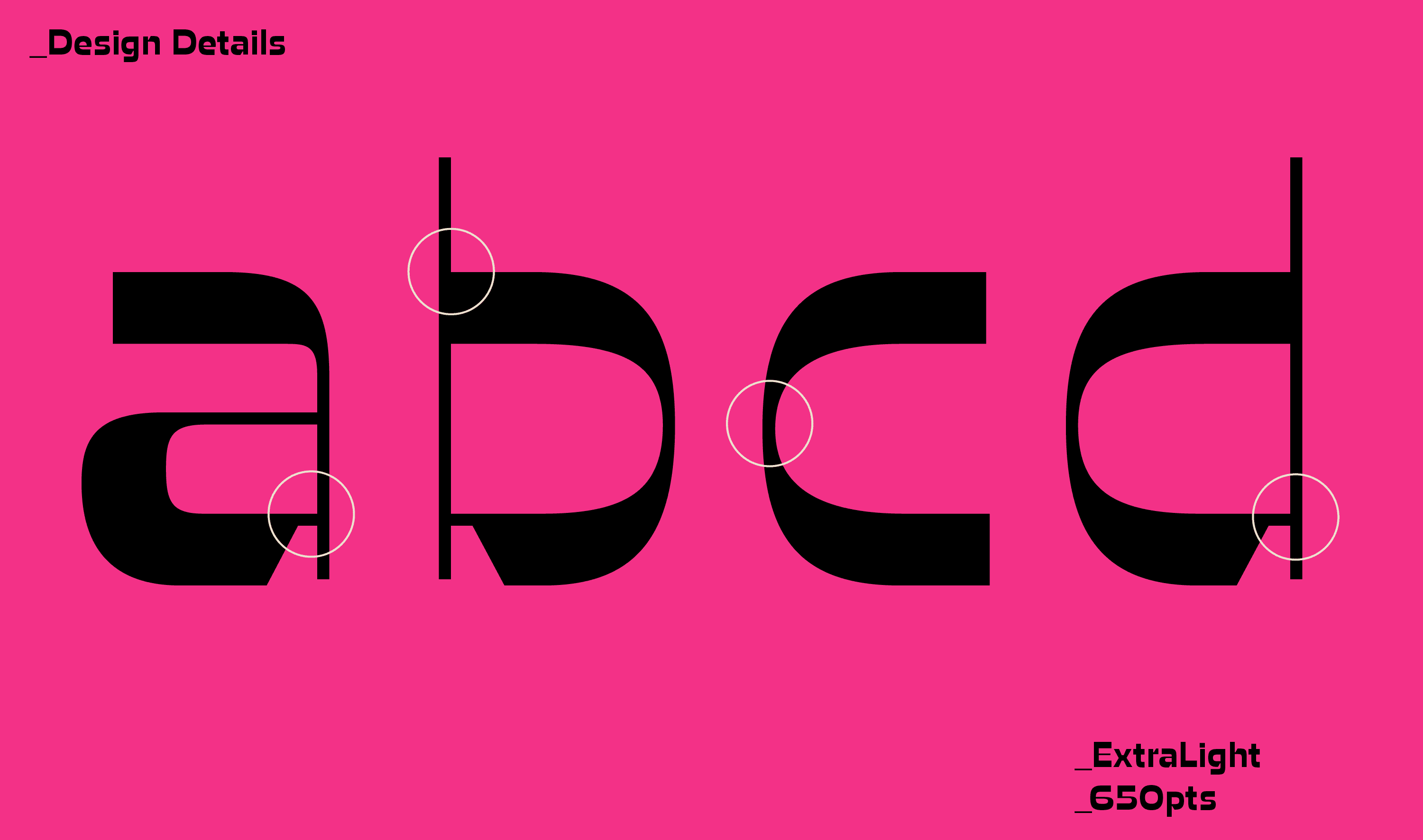
Shifting the Emphasis
Cyntra gives horizontal strokes an emphasis usually reserved for the verticals. This changes how weight is distributed within each character and how the eye moves along a line.
Round forms acquire a pronounced top and bottom. Upright strokes become quieter. Familiar combinations produce unexpected patterns of light and dark.
The effect is particularly apparent in short settings, where a title or headline gives the construction enough space to register. Individual letters contribute to a collective silhouette, making the shape of the word an active part of its expression.
Six Weights, Different Tones
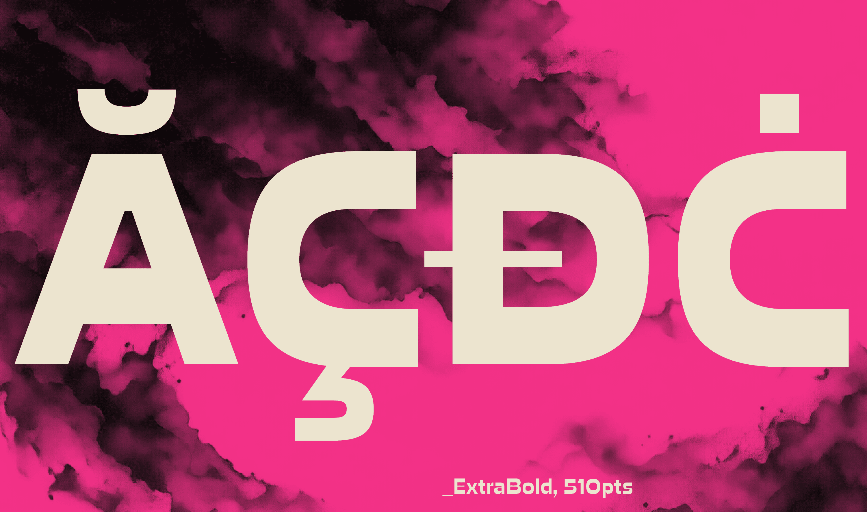
Cyntra’s six weights extend from ExtraLight to ExtraBold.
At the lighter end, the contrast produces delicate, open forms. Thin strokes sit against broader horizontal details, giving the letters an almost drawn quality. These weights benefit from generous sizing, allowing their finer structure to remain visible.
As weight increases, the horizontal emphasis becomes more assertive. Bold and ExtraBold create dense word shapes with a strong presence on a cover, poster or page.
The range allows a design to move between restraint and impact while retaining the same underlying character.
Adding Movement
Each weight has a matching oblique.
The slanted forms introduce a forward movement that changes the pace of a setting. Cyntra’s horizontal emphasis remains evident, but the relationship between the letters becomes more animated.
Used alongside the uprights, the obliques provide another level of distinction within a composition. They can separate a secondary phrase, introduce emphasis or carry a complete headline with a more urgent tone.

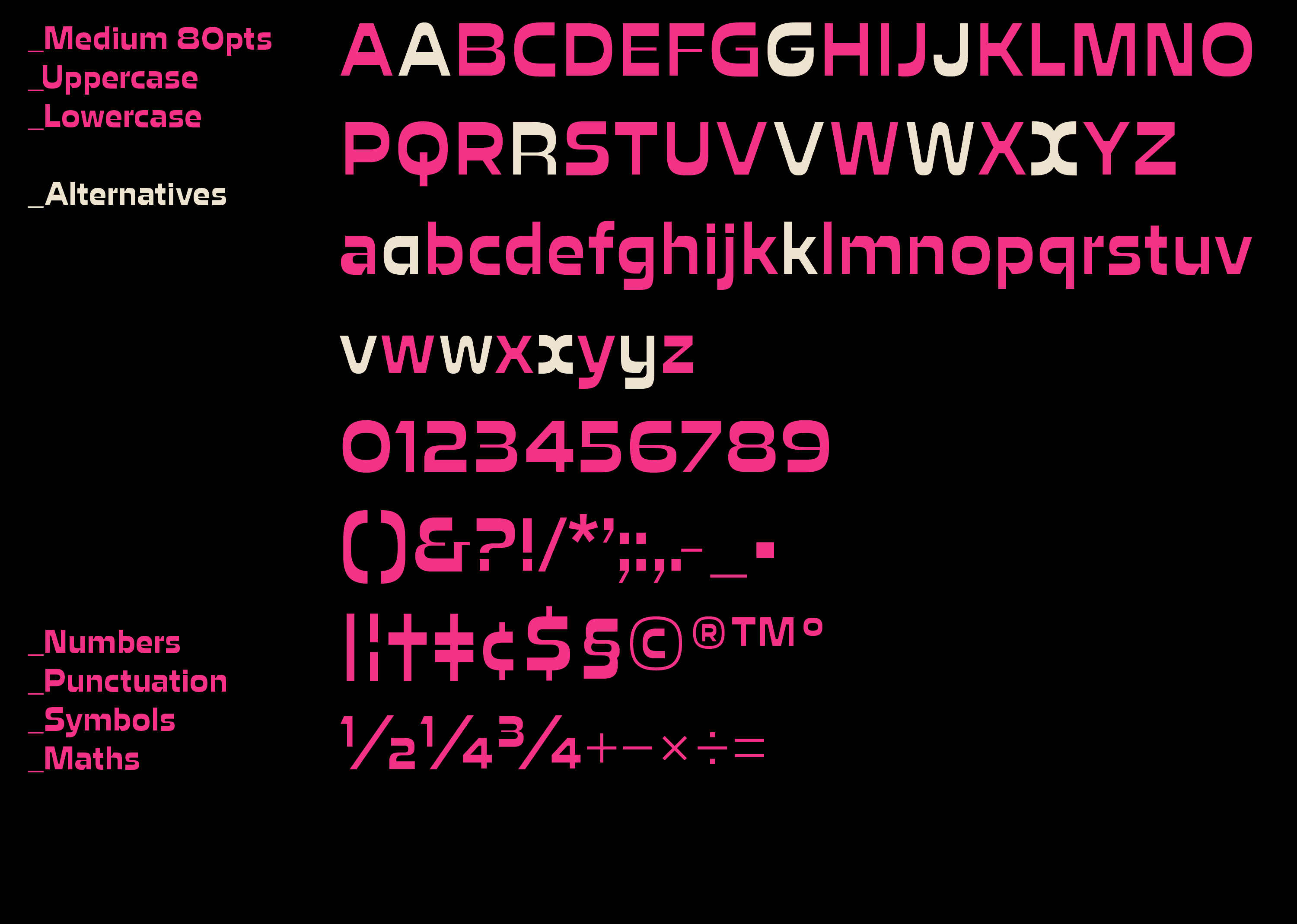
Alternative Characters
Thirteen stylistic sets provide alternatives for selected uppercase and lowercase letters.
The capitals A, G, J, R, V, W and X each have an alternative, alongside lowercase a, k, v, w, x and y. These forms allow designers to reconsider particular combinations within a word.
That flexibility is useful in display typography, where a single character can influence an entire composition. Changing an A or an R may alter the balance of a title; a different lowercase form can establish a more individual rhythm.
The alternatives invite close attention to the words being set.
A Paperback Atmosphere
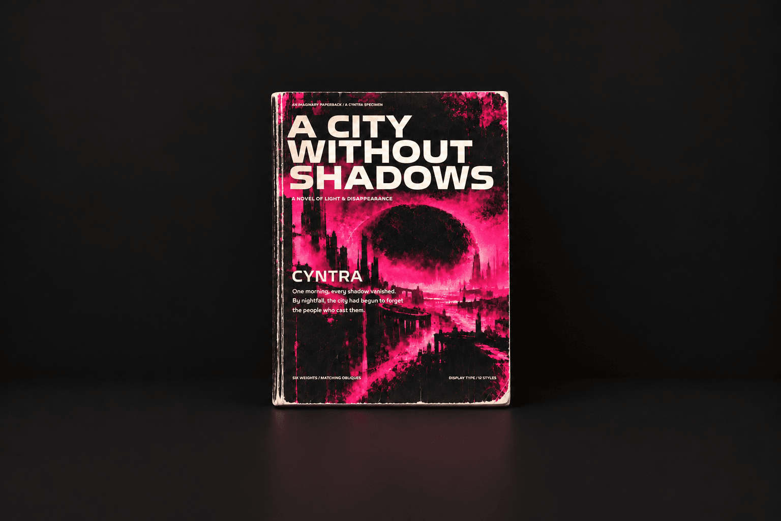
For the presentation, science fiction found a visual expression in the paperback novels of the 1960s.
Vibrant colour, abstract imagery and distressed print textures provide an atmosphere in which Cyntra’s unusual balance feels at home. The imagery leaves room for interpretation, allowing the typography to remain central.
That relationship reflects something shared by type and fiction: both can give familiar material a different meaning through the way it is presented.

Future Themes
Cyntra is designed for headlines, book covers, posters and editorial settings where typography has an active role in establishing character.
Its extended Latin character set is supported by varied numeral styles, ligatures, fractions and other OpenType features. Together with the weights, obliques and alternatives, these give the family practical scope beyond its initial visual setting.
The connection to Syntax remains part of Cyntra’s story. Reversed contrast, alternative forms and a speculative atmosphere give that starting point a different voice—one that leaves room for designers to take it further.
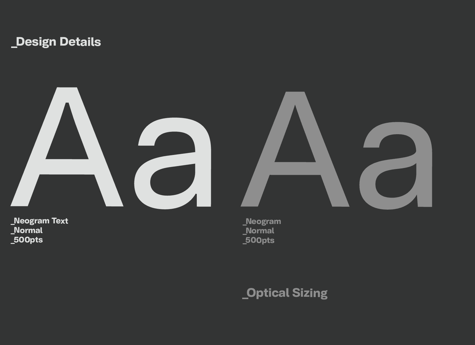
Neogram Text refines the character of the original Neogram for sustained reading, with carefully considered proportions, spacing and details focused on clarity and information.
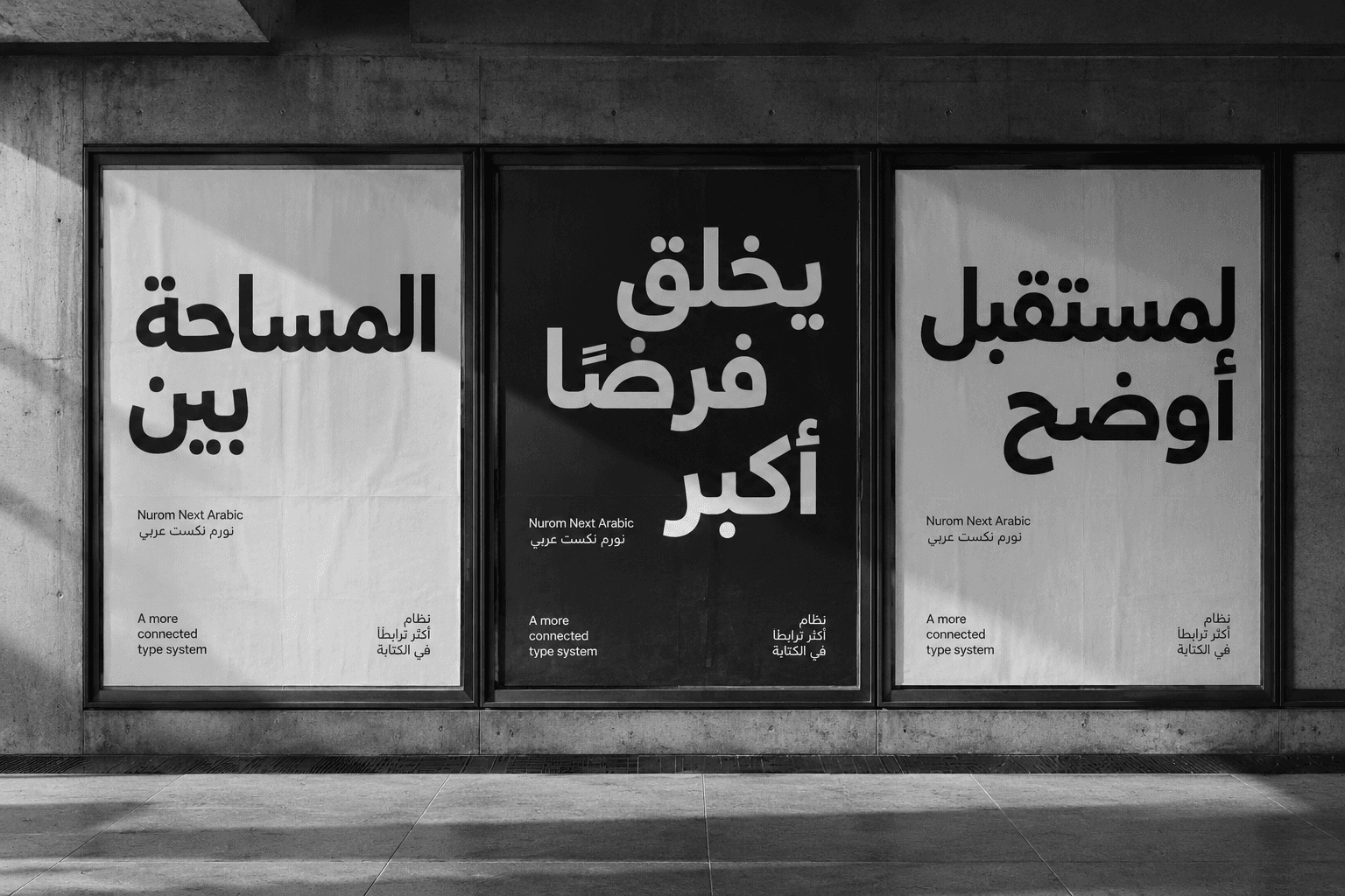
Nurom Next Arabic: Translating cultural harmony & human connection, through global communication
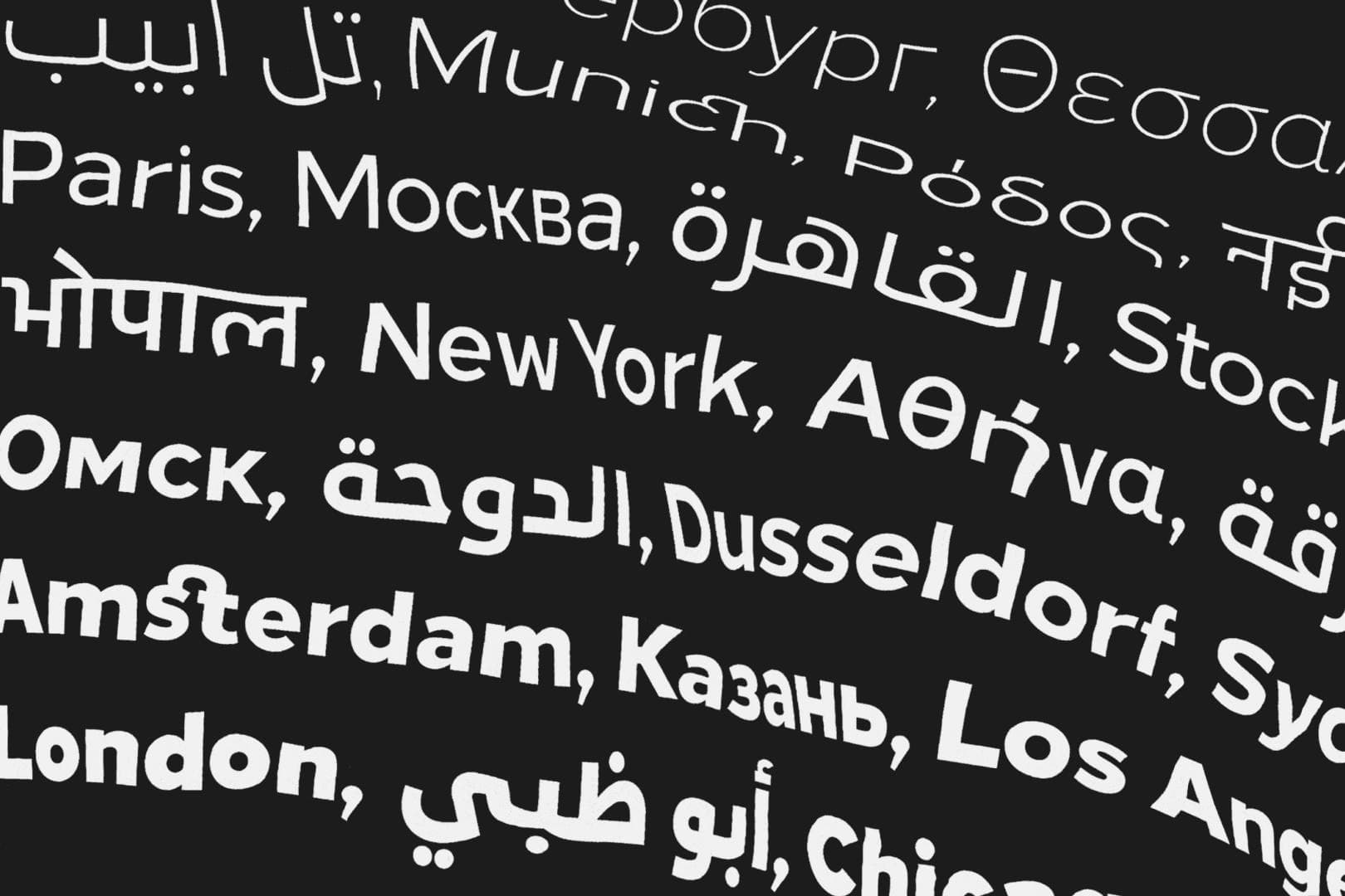
Diversifying design, enabling evolution and mastering universal communication. — The story of The Northern Block’s ‘Next Series’.